

The topic of stylization of fonts is inexhaustible. It is the fonts that are best suited for experiments with styles, overlay, texturing modes, and other ways of decoration.
The desire to somehow change, improve the inscription on your composition, occurs from each photocopera when looking at the unbroken system fonts.
Stylization of font
As we know, fonts in Photoshop (before saving or rasterization) are vector objects, that is, with any processing, the clarity of the lines are retained.Today's stylization lesson will not have any clear theme. Let's call it "a little retro". We simply experiment with the styles and study one interesting appointment of texture overlay on the font.
So let's start first. And for the beginning we will need a background for our inscription.
Background
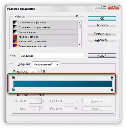
Create a new layer for the background and fill it with a radial gradient so that a small glow appeared in the center of the canvas. In order not to overload less than a lesson, read the lesson on gradients.
Lesson: How to make a gradient in photoshop
The gradient used in the lesson:
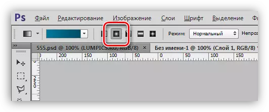
The button to be activated to create a radial gradient:
As a result, we get something like this background:
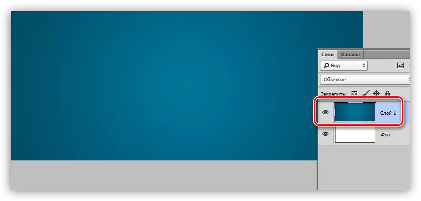
With the background we will also work, but at the end of the lesson, so as not to be distracted from the main topic.
Text
C text should also be all clear. If not all, then read the lesson.
Lesson: Create and edit text in Photoshop
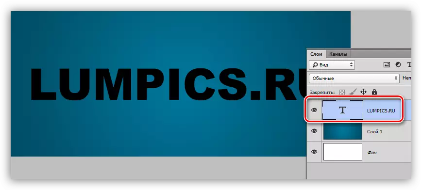
Create an inscription of the desired size and any color, as we will get rid of the color in the stylization process. The font is desirable to choose with greasy glyphs, for example, Arial Black. As a result, it should be approximately such an inscription:
Preparatory work is over, go to the most interesting - stylization.
Stylization
Stylization is a fascinating and creative process. As part of the lesson, only techniques will be shown, you can take them into service and put your experiments with flowers, textures and other things.
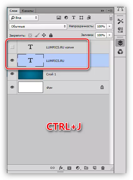
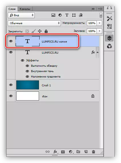
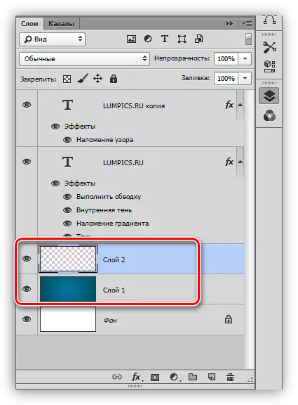
- Create a copy of the text layer, in the future it will be needed to apply texture. The visibility of the copy is turned off and turn back to the original.
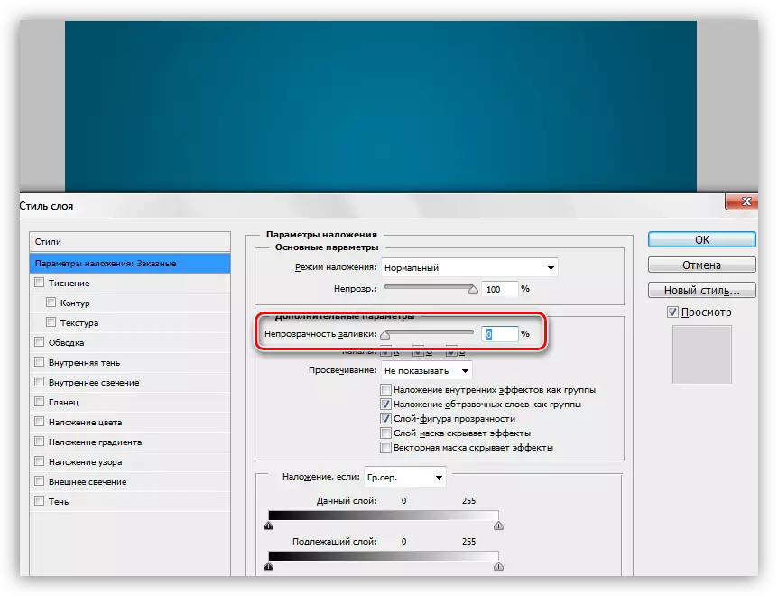
- Two times with the left button on the layer, opening the styles window. Here the first thing is completely removing the fill.
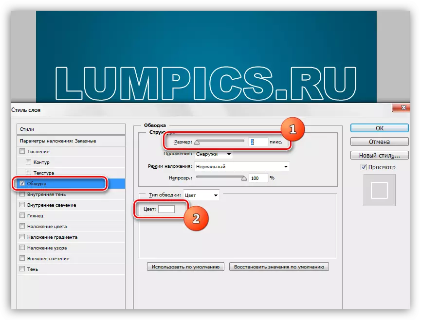
- The first style is "stroke". Color choose white, size depending on the size of the font. In this case, 2 pixels. The main thing is that the stroke is clearly visible, it will play the role of "Borchik".
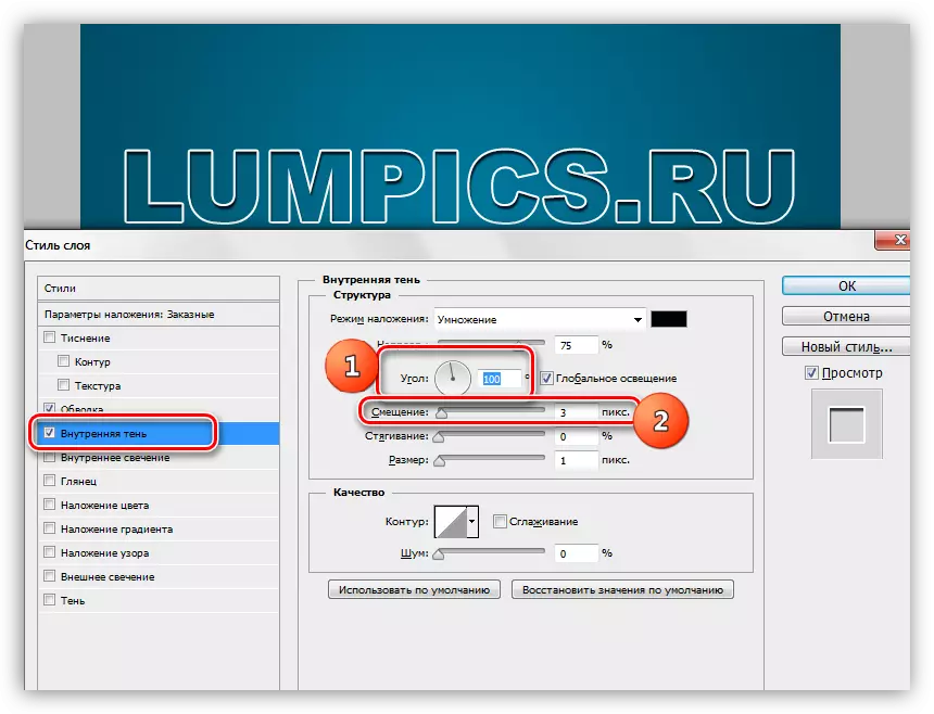
- The next style is "internal shadow". Here we are interested in the angle of displacement, which we will do 100 degrees, and, in fact, the displacement itself. Size choose at your discretion, just not too big, it is still a "side", and not "brush".
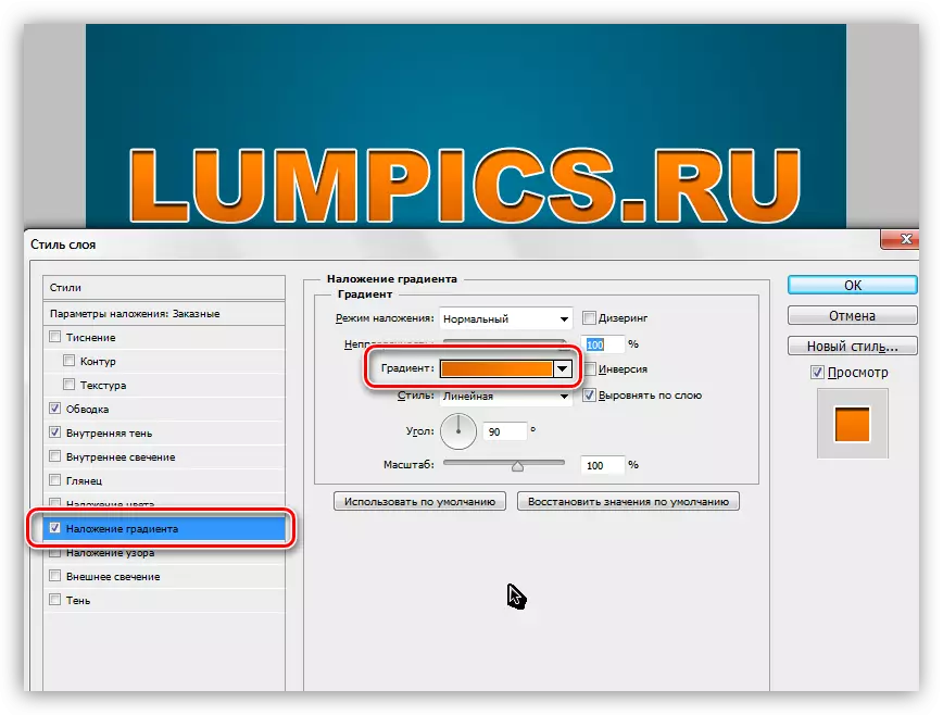
- Next follows the "overlay gradient". In this block, everything happens in the same way as when creating a conventional gradient, that is, we click on the sample and configure. In addition to setting up the gradient colors, nothing else is required.
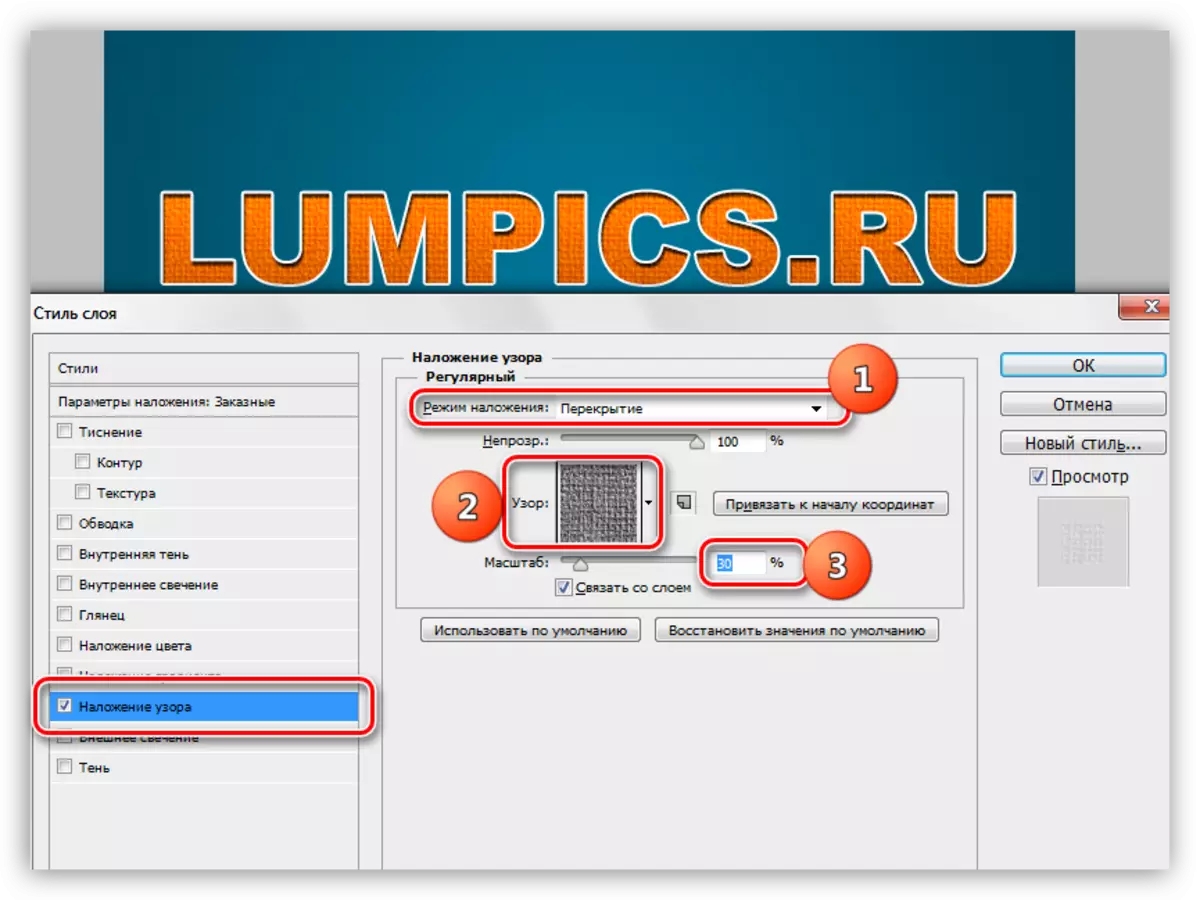
- It is time to apply the texture to our text. Go to a copy of the text layer, we include visibility and open styles.
We remove the fill and go to style called "Pattern". Here we choose the pattern similar to canvas, the imposition mode is changed to "overlap", the scale is reduced to 30%.
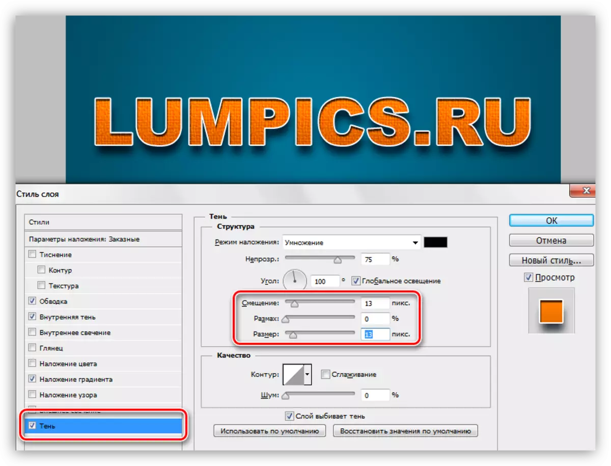
- Our inscription lacks only shadows, so we turn to the original layer with the text, open styles and go to the "Shadow" section. Here are guided by only our own feelings. You need to change two parameters: size and offset.
The inscription is ready, but there are several strokes, without which it is impossible to be considered complete.
Climate refinement
With the background, we will perform the following actions: add quite a lot of noise, and also give inhomogeneity to color.
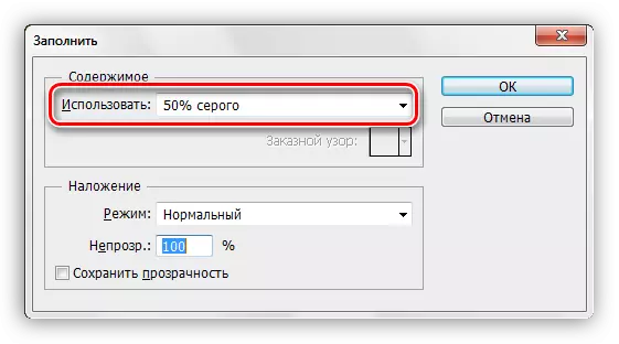
- Go to the layer with the background and create a new layer over it.
- This layer we need to pour 50% gray. To do this, press the SHIFT + F5 keys and select the appropriate item in the drop-down list.
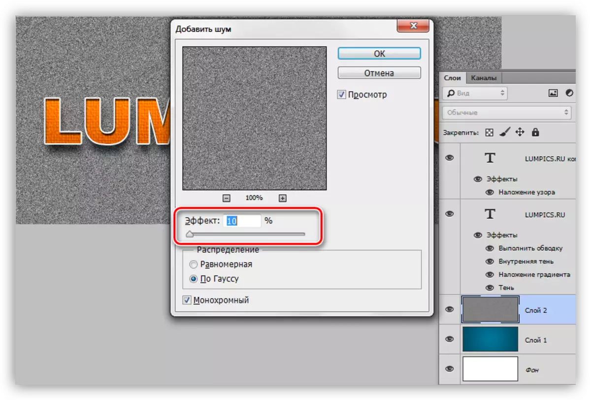
- Next, go to the "Filter - Noise - Add Noise" menu. Grain size is chosen quite large, about 10%.
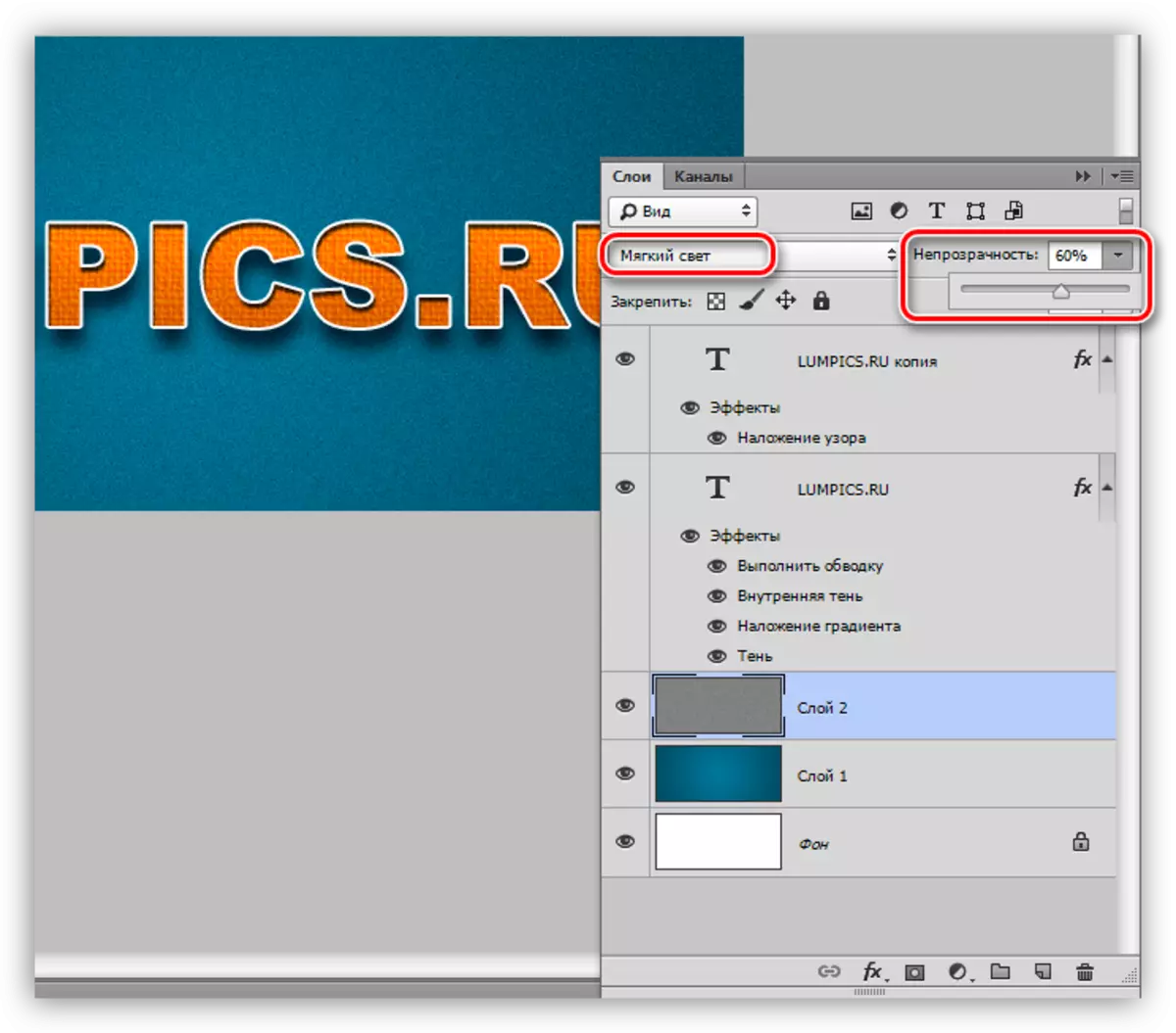
- The overlay mode for the noise layer must be replaced with "soft light" and, if the effect is too pronounced, reduce opacity. In this case, a value of 60% is suitable.
- Uneven coloring (brightness) also give with filter. It is located in the "Filter - Rendering - Clouds" menu. The filter does not require configuration, and simply randomly generates texture. To apply the filter, we need a new layer.
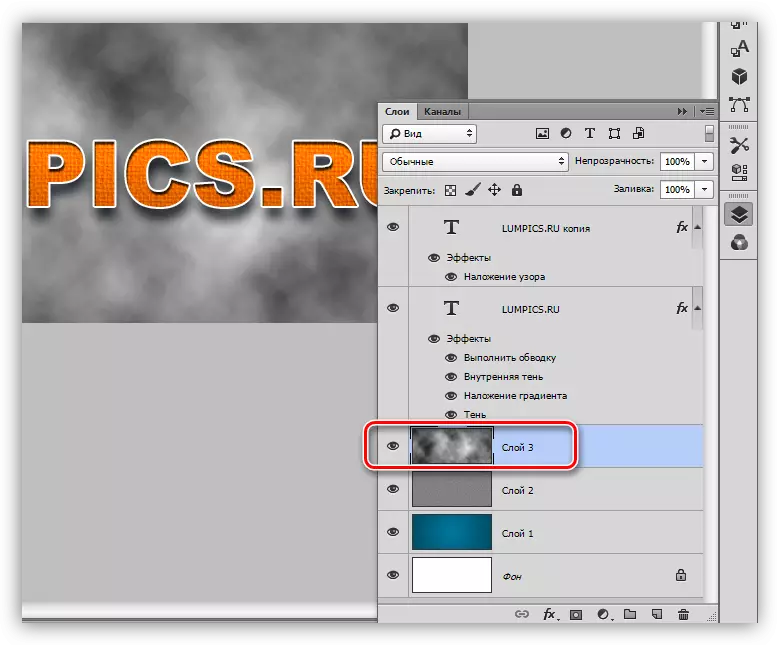
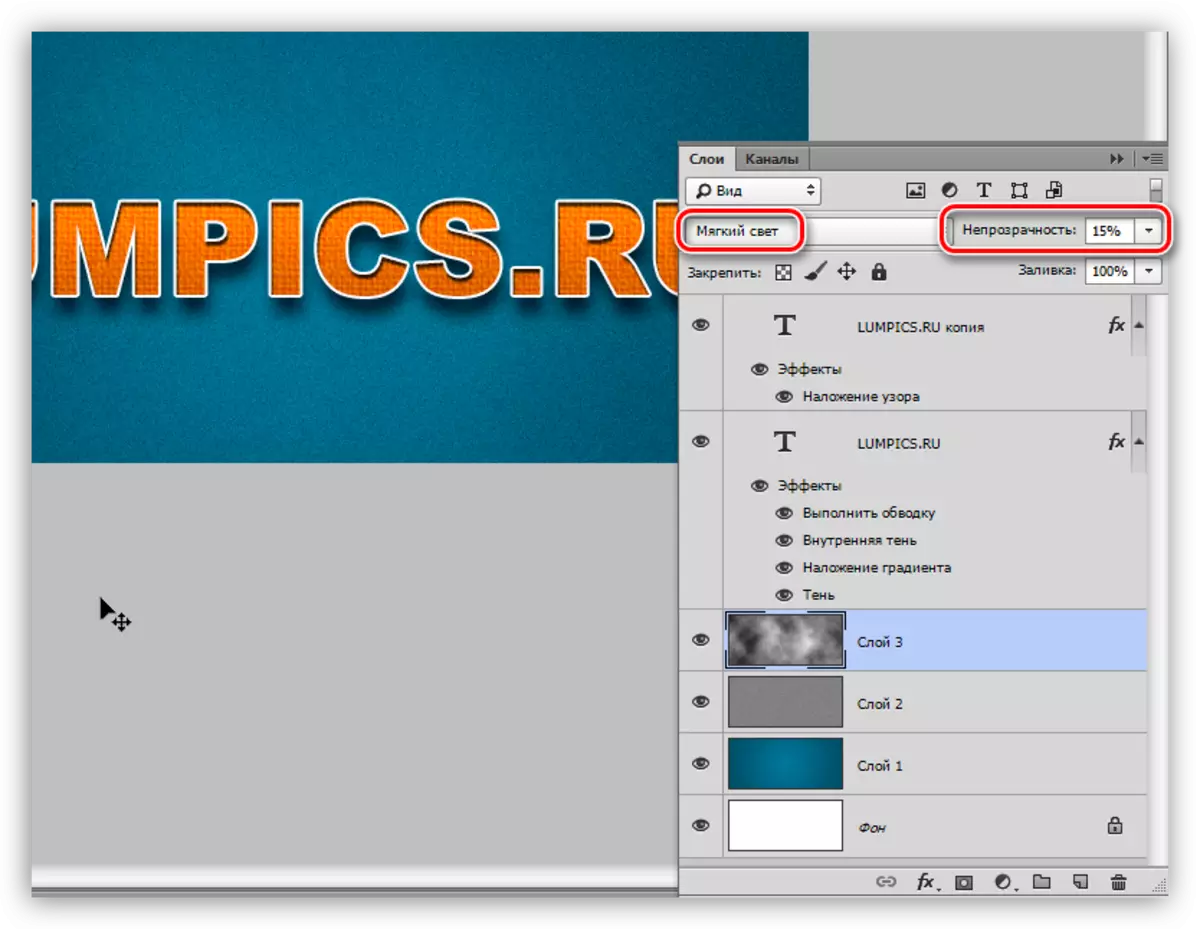
- Again, change the overlay mode for the layer with the clouds to the "soft light" and reduce the opacity, this time quite strongly (15%).
We dealt with the background, now he is not such a "new", then let us give the whole composition with light vintage.
Reducing saturation
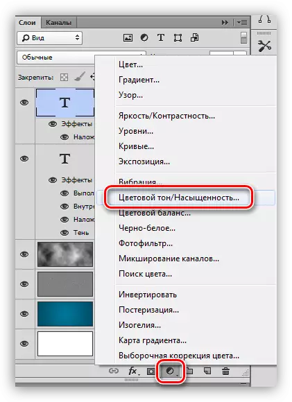
In our image, all the colors are very bright and saturated. It just needs to be corrected. We will make it using the corrective layer "Color Tone / Saturation". This layer must be created at the very top of the palette of the layers so that the effect applies to the entire composition.
1. Go to the topmost layer in the palette and create a previously voiced correction layer.
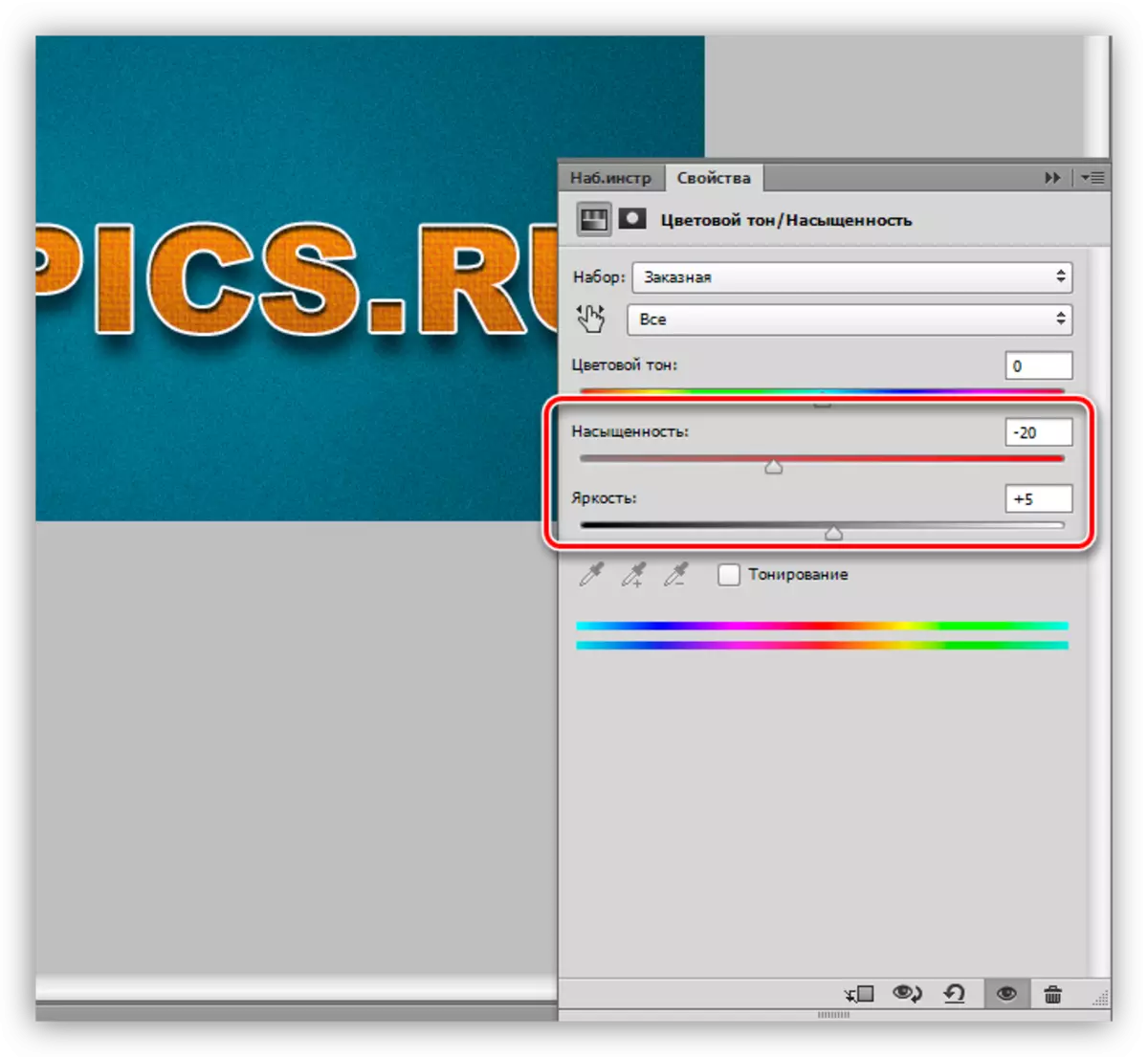
2. Using the slider "saturation" and "brightness" we achieve the muffling of colors.
On this mockery of text, perhaps, we will finish. Let's see what we've usually happen.

Here is a pretty inscription.
Let's summarize the lesson. We learned to work with text styles, as well as another way of imposing texture on the font. All information that is contained in the lesson is not a dogma, everything is in your hands.