

To assess the level of inequality between different layers of the population of society, the Lorentz curve and a derivative from her indicator - the Ginny coefficient is often used. With the help of them, it is possible to determine how large a social gap in society between the richest and poorest segments of the population. Using the Excel application tools, you can significantly facilitate the procedure for constructing the Lorentz curve. Let's see, as in the Excel environment it can be done in practice.
Using the Lorentz curve
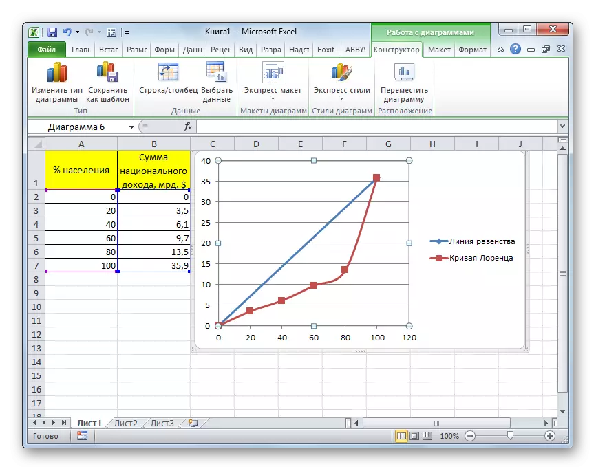
The Lorentz curve is a typical distribution function displayed graphically. According to the X axis of this function, the number of population in the percentage ratio of increasing, and along the Y axis is the total number of national income. Actually, the Lorentz curve itself consists of points, each of which corresponds to the percentage ratio of the income level of a certain part of society. The larger the Lorentz line is, the more in society the level of inequality.In the ideal situation in which there is no public inequality, each group of the population has the level of income is directly proportional to its number. A line characterizing such a situation is called the equality curve, although it is a straight line. The larger the area of the figure, limited Lorentz curve and the equality curve, the higher the level of inequality in society.
Lorentz curve can be used not only to determine the situation of property separation in the world, in a particular country or in society, but also for comparison in this aspect of individual households.
Vertical straight line, which connects the line of equality and the most remote point of the Lorentz curve is called the Hoover index or Robin Hood. This segment shows which magnitude of income to redistribute in society to achieve complete equality.
The level of inequality in society is determined using the Ginny index, which can vary from 0 to 1. It is also called the coefficient of income concentration.
Building equality line
Now let's see on a specific example, how to create a line of equality and Lorentz curve in Excel. To do this, use the table of the number of population broken into five equal groups (20%), which are summarized in the table by increasing. In the second column of this table, the amount of national income in the percentage ratio, which corresponds to a specific group of the population is presented.
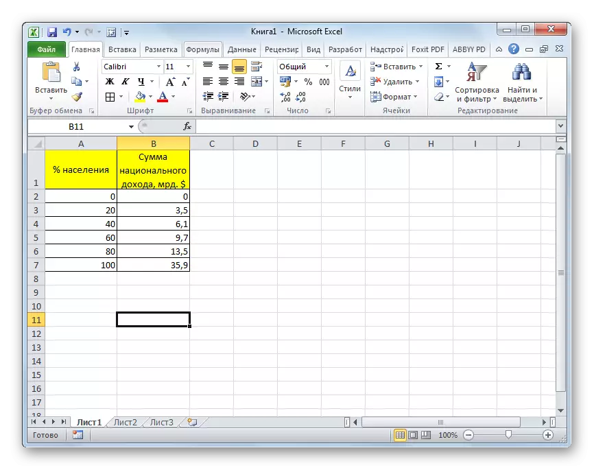
To begin with, we construct the line of absolute equality. It will consist of two dots - zero and point of total national income for 100% of the population.
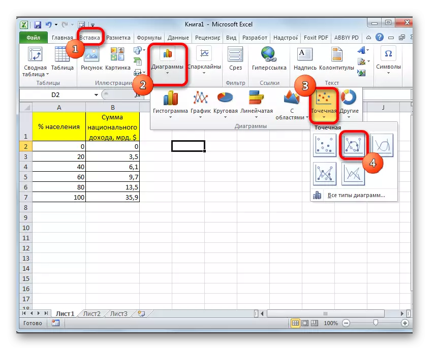
- Go to the "Insert" tab. On the line in the "diagram" tool block, click on the "Spot" button. It is this type of diagrams that is suitable for our task. The following opens a list of subspecies of charts. Choose "Spotted with smooth curves and markers."
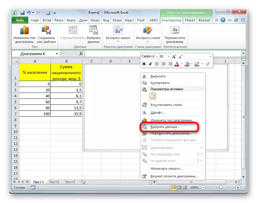
- After this action is performed an empty area for the chart. It happened because we did not choose the data. In order to make data and build a chart, click on the right mouse button on an empty area. In the activated context menu, select the "Select data ..." item.
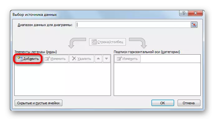
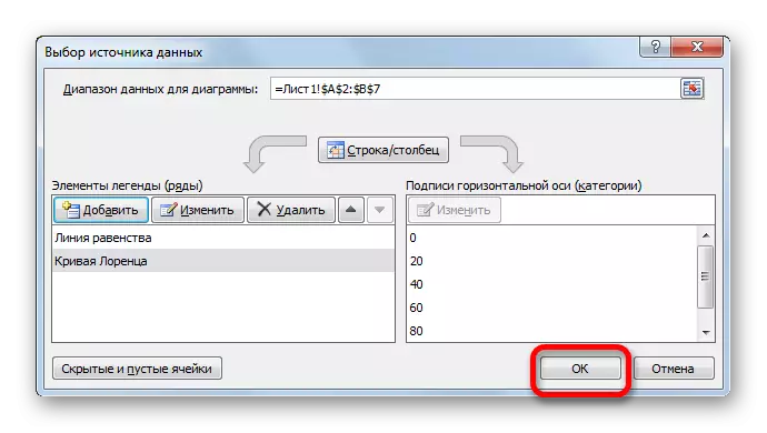
- A data source selection window opens. In the left of it, which is called "elements of legends (ranks)" by click on the "Add" button.
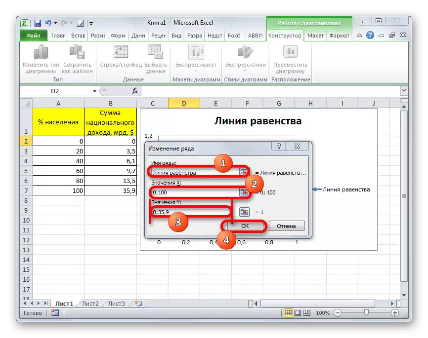
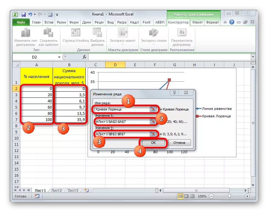
- The window change window is launched. In the "Row Name" field, you write the name of the diagram that we want to assign. It can also be located on the sheet and in this case you need to specify the address of the cell of its location. But in our case it is easier to just enter the name manually. We give the diagram the name "line of equality".
In the X Value field, you should specify the coordinates of the points of the diagram along the X axis. As we remember, there will be only two of them: 0 and 100. We write these values through the point with a comma in this field.
In the "V values" field, the coordinates of the points along the Y axis should be written. There will also be two: 0 and 35.9. The last point, as we can see according to the schedule, meets the total national income of 100% of the population. So, write the values "0; 35.9" without quotes.
After all the indicated data is made, click on the "OK" button.
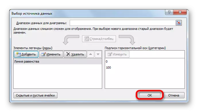
- After that, we return to the data source selection window. In it, too, click on the "OK" button.
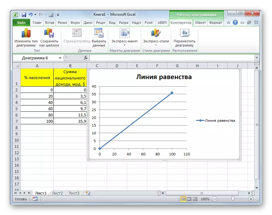
- As we can see, after the above actions, the equality line will be built and will appear on the sheet.
Lesson: How to make a chart in exile
Creating a Lorentz curve
Now we have to directly build the Lorentz curve, relying on the tabular data.
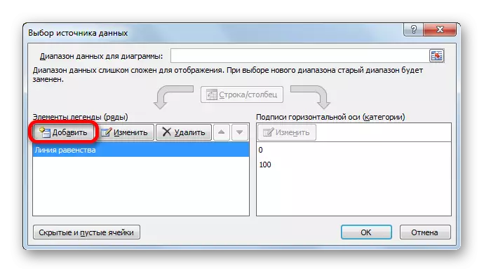
- Right-click on the diagram area, on which the equality line is already located. In the running menu, stop the selection on the "Select data ...".
- The data selection window opens again. As we see, among the elements, the name "line of equality" is already presented, but we need to make another chart. Therefore, we click on the "Add" button.
- The window change window opens again. The "Row name" field, as the last time, fill it manually. Here you can enter the name "Lorentz curve".
In the "X Value" field, all data of the column "% of the population" of our table should be applied. To do this, set the cursor to the field area. Next, clamp the left mouse button and select the corresponding column on the sheet. The coordinates will immediately be displayed in the Row Changes window.
In the "V values" field, we entered the coordinates of the cells of the column "National income". We do this according to the same technique on which the data was made in the previous field.
After all the above data is made, press the "OK" button.
- After returning to the source selection window, click on the "OK" button.
- As we can see, after performing the above actions, the Lorentz curve will also be displayed on the Excel sheet.

The construction of the Lorentz curve and the equality line in Excel is produced on the same principles as the construction of any other type of charts in this program. Therefore, for users who captured the ability to build diagrams and graphs in Excel, this task should not cause big problems.