

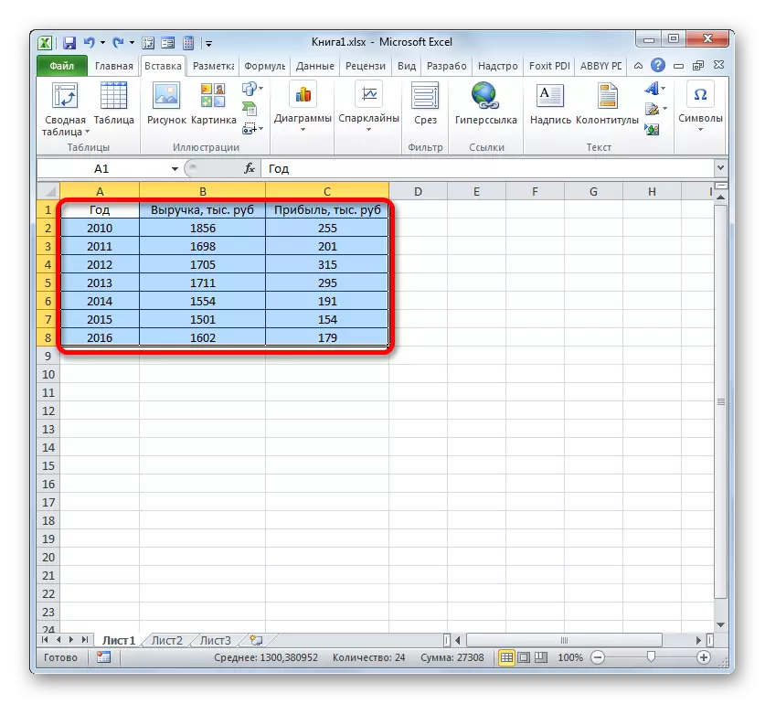
One typical mathematical task is to build a dependency schedule. It displays the dependence of the function from changing the argument. On paper, this procedure is not always simple. But Excel Tools, if we secure themselves to master them, allow you to perform this task accurately and relatively quickly. Let's find out how this can be done using various source data.
Graphic creation procedure
The dependence of the function of the argument is a typical algebraic dependence. Most often, the argument and the value of the function is made to display the symbols: respectively, "x" and "y". Often, it is necessary to make a graphical display of the dependence of the argument and the functions that are recorded in the table, or are presented as part of the formula. Let's analyze specific examples of constructing such a graph (diagrams) under various setpoint conditions.Method 1: Creating a Dependency Screen Based Table
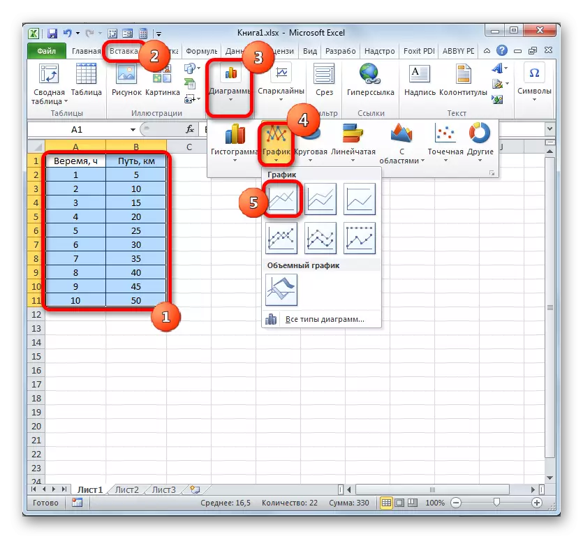
First of all, we will analyze how to create a graph based on data based on a table array. We use the table of dependence of the traveled path (y) on time (x).
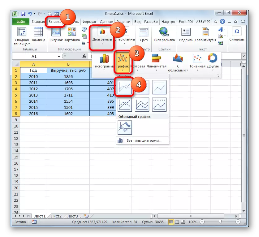
- We highlight the table and go to the "Insert" tab. Click on the "schedule" button, which has localization in the chart group on the ribbon. The choice of various types of graphs opens. For our purposes, choose the easiest. It is located first in the list. Clay on it.
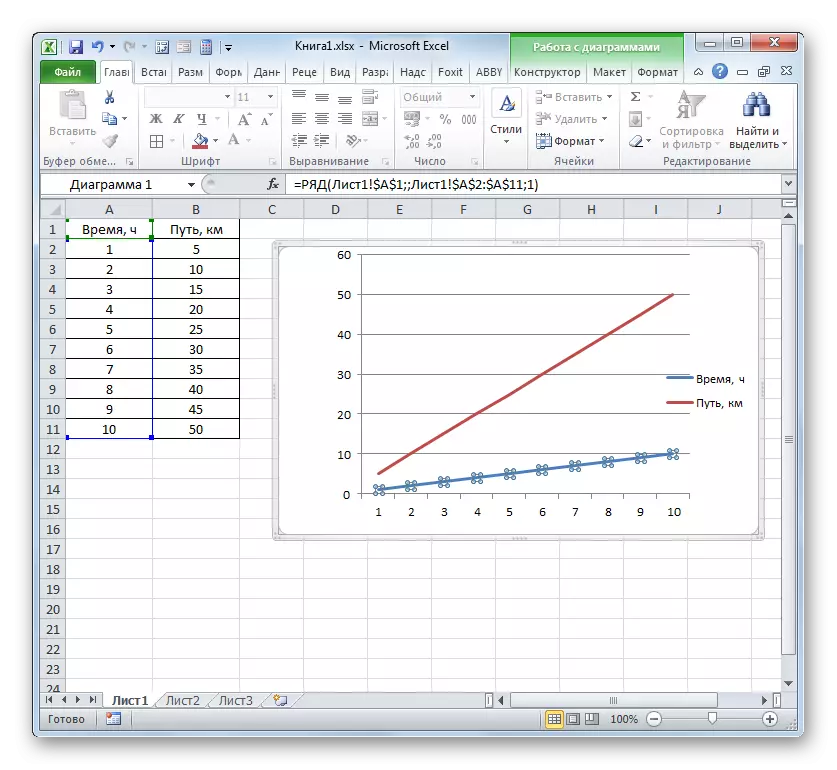
- The program manufactures the diagram. But, as we see, two lines are displayed on the construction area, while we need only one: displays the dependence of the distance from time to time. Therefore, we allocate the left mouse button with a blue line ("time"), as it does not match the task, and click the DELETE key.
- The selected line will be deleted.
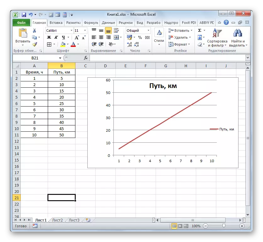
Actually, on this, the construction of the simplest character schedule can be considered completed. If you wish, you can also edit the names of the chart, its axes, remove the legend and produce some other changes. This is described in more detail in a separate lesson.
Lesson: how to make a schedule in Excel
Method 2: Creating actions with multiple lines
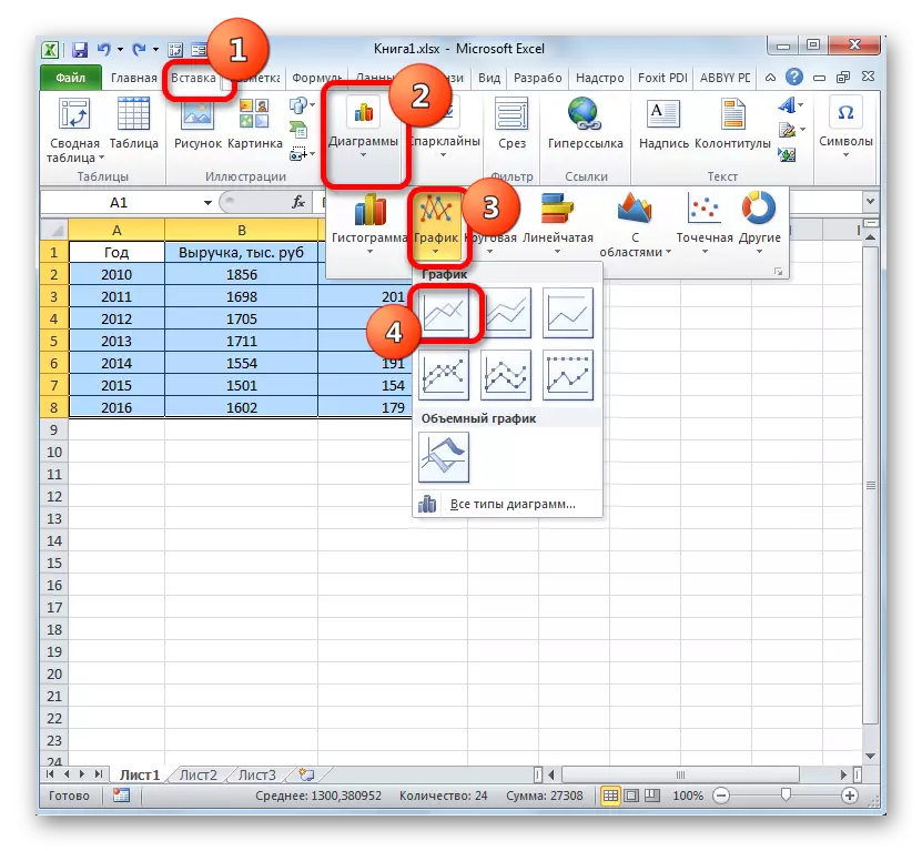
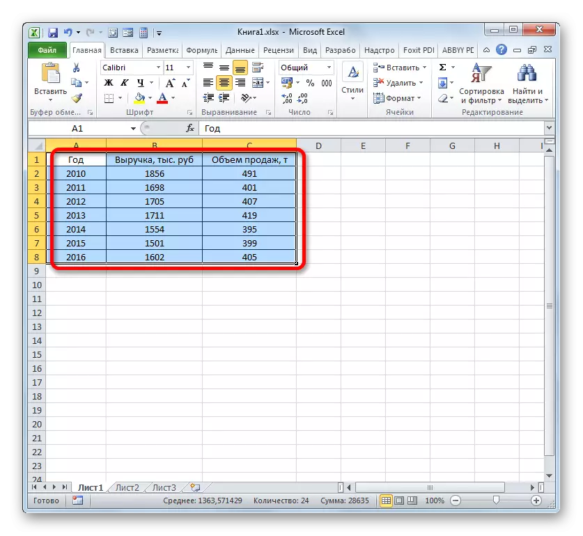
A more complex embodiment of a dependency graph is the case when one argument corresponds to two functions at once. In this case, you will need to build two lines. For example, take a table in which the general revenue of the enterprise and its net profit is painted.
- We highlight the entire table with the cap.
- As in the previous case, we click on the "schedule" button in the charts section. Again, choose the very first option presented in the list that opens.
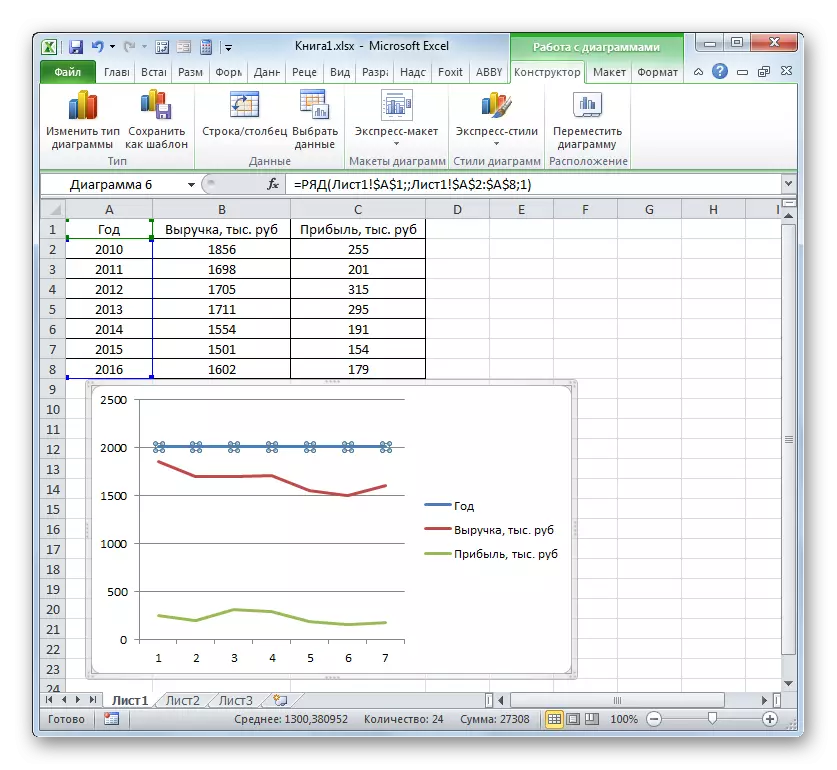
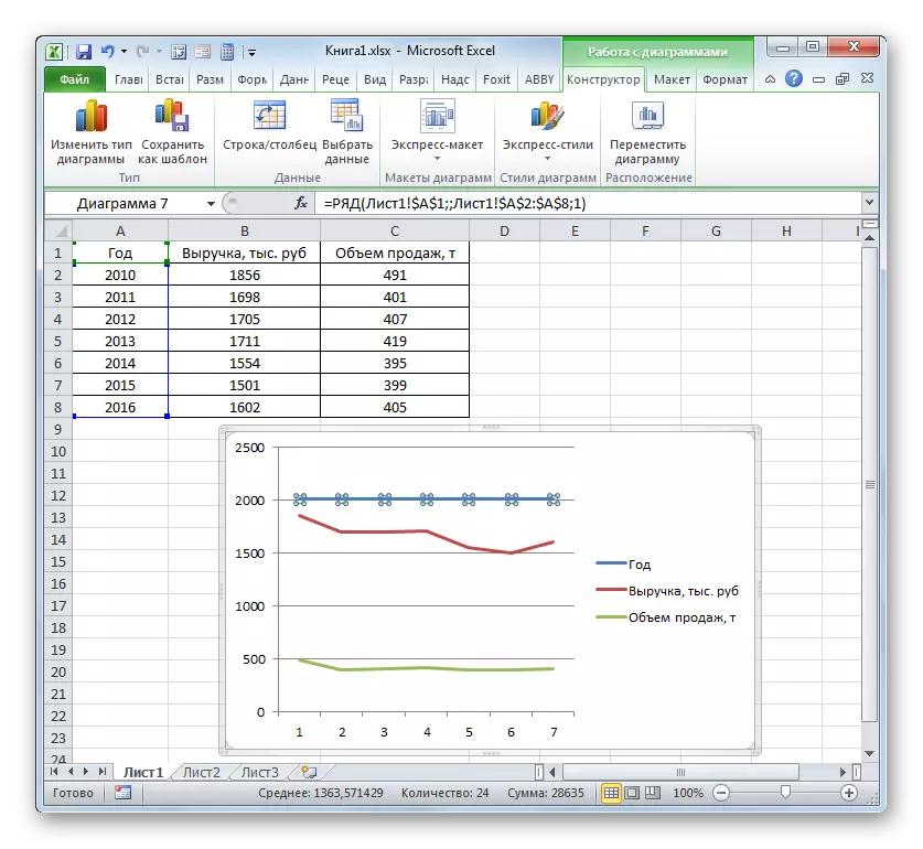
- The program produces graphic construction according to the data obtained. But, as we see, in this case, we have not only an excess third line, but also notation on the horizontal axis of the coordinates do not correspond to those required, namely the order of the year.
Immediately delete an excess line. She is the only direct on this diagram - "Year." As in the previous way, we highlight the click on it with the mouse and click on the Delete button.
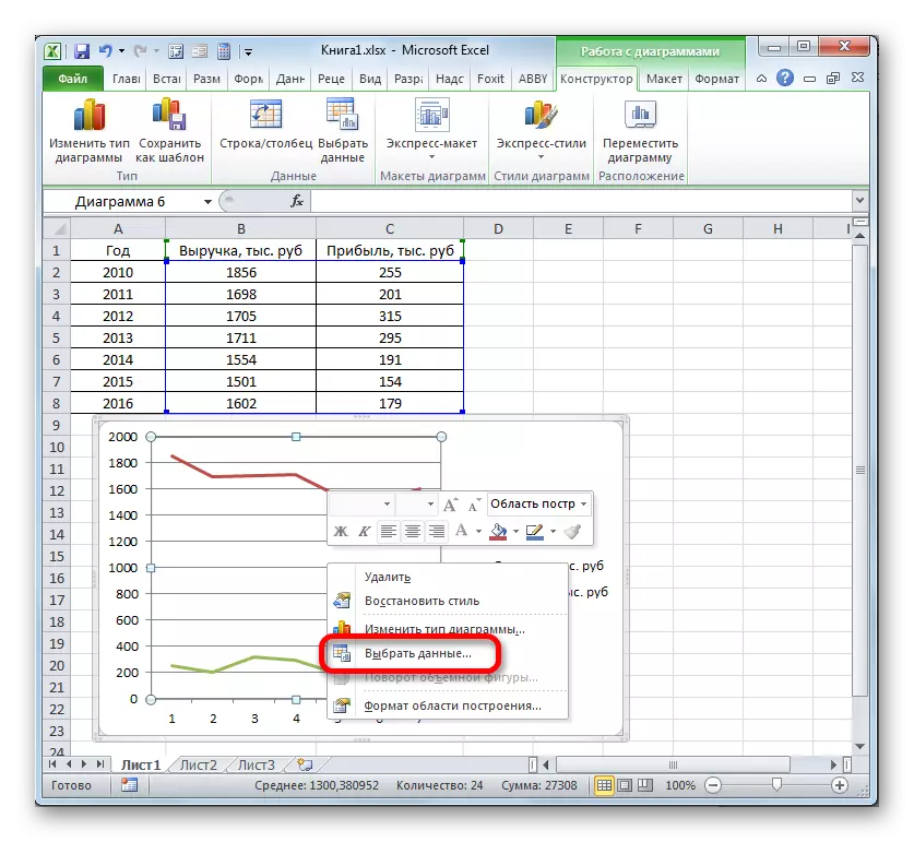
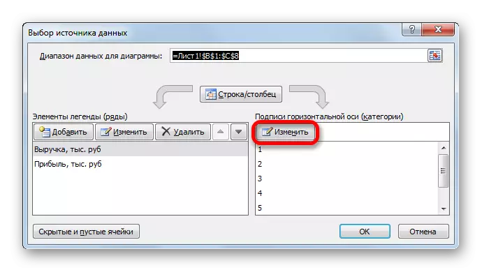
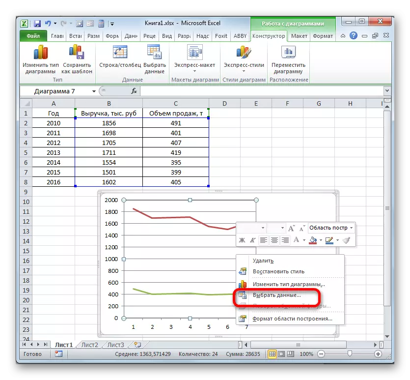
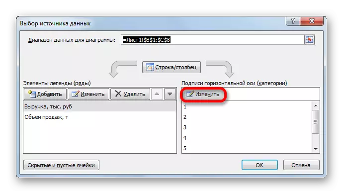
- The line has been removed and together with it, as you can notice, the values on the vertical coordinate panel are transformed. They became more accurate. But the problem with the wrong display of the horizontal axis of the coordinate remains. To solve this problem, click on the field of building the right mouse button. In the menu, you should stop selecting "Select Data ...".
- The source selection window opens. In the "horizontal axis signature" block, click on the "Change" button.
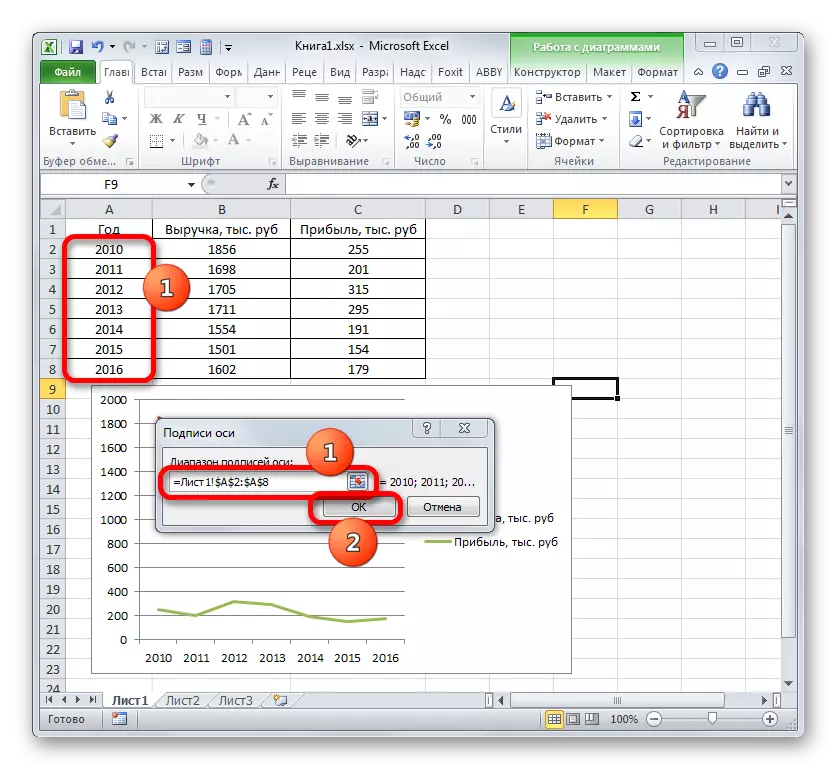
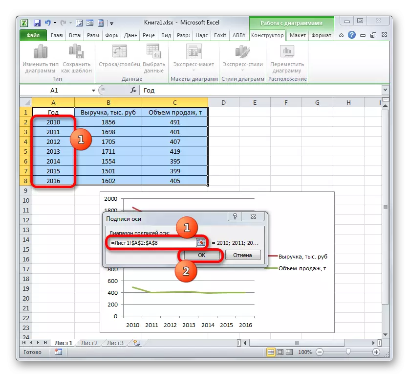
- The window opens even less than the previous one. In it, you need to specify the coordinates in the table of those values that should be displayed on the axis. To this end, set the cursor to the only field of this window. Then I hold the left mouse button and select the entire contents of the Year column, except for its name. The address will immediately affect the field, click "OK".
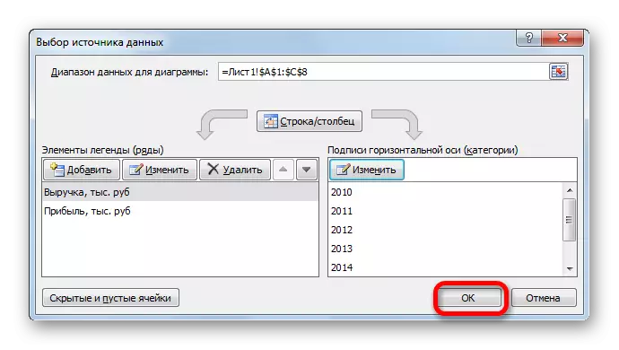
- Returning to the data source selection window, also click "OK".
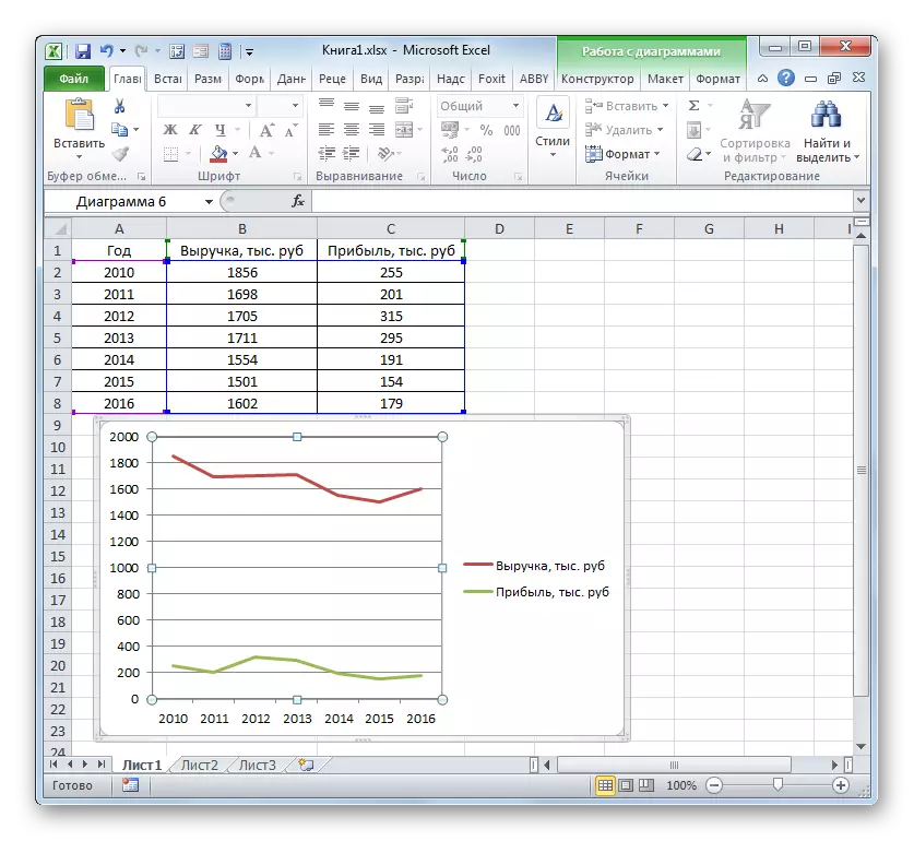
- After that, both graphics placed on the sheet are displayed correctly.
Method 3: Construction of the Graphics when using various units of measurement
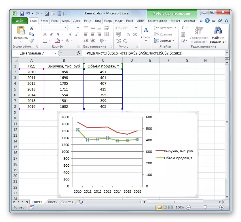
In the previous method, we considered the construction of a diagram with several lines on the same plane, but all the functions had the same measurement units (thousand rubles). What should I do if you need to create a dependency schedule based on a single table, in which the units of measurement function differ? Excel has output and from this position.
We have a table, which presents data on the volume of sales of a certain product in tons and in revenue from its implementation in thousands of rubles.
- As in previous cases, we allocate all the data of the table array along with the cap.
- Clay on the "schedule" button. We again choose the first option of building from the list.
- A set of graphic elements is formed on the construction area. In the same way, which was described in previous versions, we remove the excess year "Year".
- As in the previous way, we should display the year on the horizontal coordinate panel. Click on the construction area and in the list of action, select the option "Select Data ...".
- In a new window, you make a click on the "Change" button in the "Signature" block of the horizontal axis.
- In the next window, producing the same actions that were described in detail in the previous method, we introduce the coordinates of the Year column to the area of the Axis Signature Range. Click on "OK".
- When you return to the previous window, you also perform a click on the "OK" button.
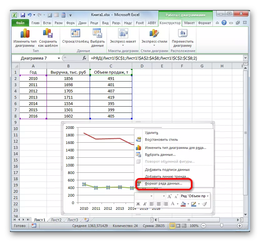
- Now we should solve the problem with which they have not yet met in previous cases of construction, namely, the problem of inconsistency of units of values. After all, you will agree, they cannot be located on the same division coordinate panel, which simultaneously designate a sum of money (thousand rubles) and mass (tons). To solve this problem, we will need to build an additional vertical axis of coordinates.
In our case, to designate revenue, we will leave the vertical axis that already exists, and for the "sales volume" will create auxiliary. Clay on this line right mouse button and choose from the list "The format of a number of data ...".
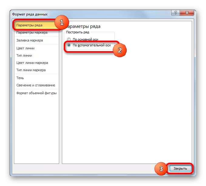
- A number of data format window is launched. We need to move to the "Parameters" section, if it was open in another section. In the right side of the window there is a block "Build a row". You need to install the switch to the position "by auxiliary axis". Clay for the name "Close".
- After that, the auxiliary vertical axis will be built, and the sales line will be reoriented to its coordinates. Thus, work on the task is successfully completed.

Method 4: Creating a dependency graph based on an algebraic function
Now let's consider the option of building a dependency schedule that will be set by an algebraic function.
We have the following function: y = 3x ^ 2 + 2x-15. On its basis, it is necessary to construct a graph of the dependences of the values of Y from x.
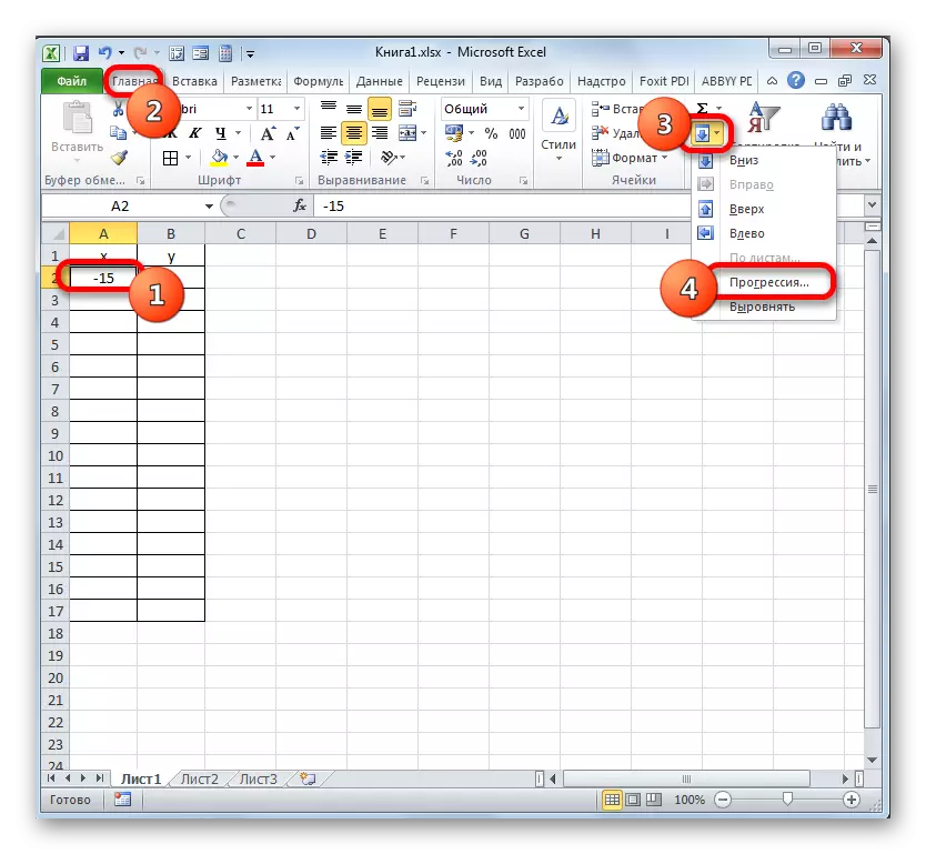
- Before proceeding to building a diagram, we will need to make a table based on the specified function. The values of the argument (X) in our table will be listed in the range from -15 to +30 in step 3. To speed up the data introduction procedure, resort to the use of the "Progression" tool.
We indicate in the first cell of the column "x" the value "-15" and allocate it. In the "Home" tab, the clay on the "Fill" button located in the Editing unit. In the list, choose the "Progression ..." option.
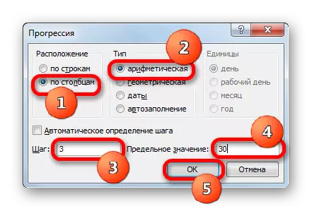
- The activation of the "Progression" window is performed. In the "Location" block, mark the name "on columns", since we need to fill exactly the column. In the "Type" group, leave the "arithmetic" value, which is set by default. In the "Step" area, set the value "3". In the limit value, we set the number "30". Perform a click on "OK".
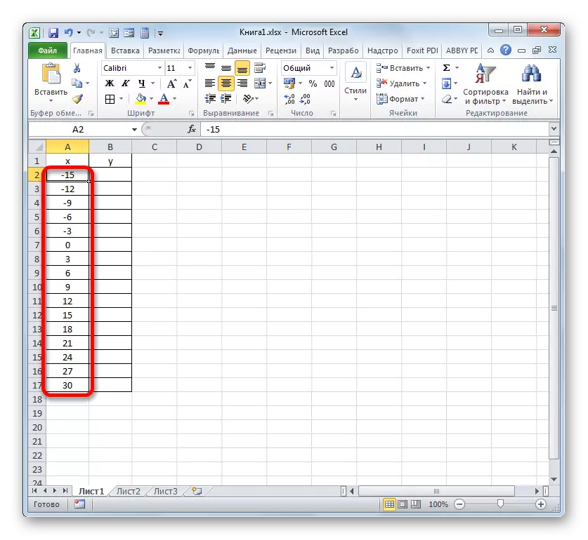
- After performing this algorithm of action, the entire column "X" will be filled with values in accordance with the specified scheme.
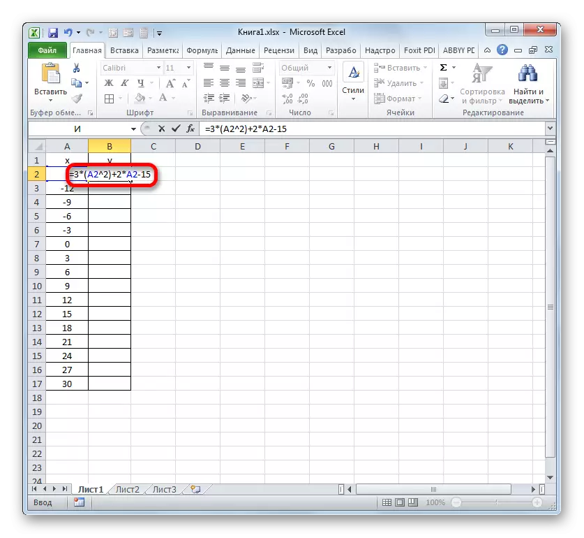
- Now we need to set the values of Y that would correspond to certain values of X. So, we recall that we have the formula y = 3x ^ 2 + 2x-15. It is necessary to convert it to the Excel formula, in which the X values will be replaced by references to table cells containing the corresponding arguments.
Select the first cell in the "Y" column. Considering that in our case, the address of the first argument X is represented by A2 coordinates, then instead of the formula above, we obtain such an expression:
= 3 * (A2 ^ 2) + 2 * A2-15
We write this expression in the first cell of the "Y" column. To get the result of the calculation, click the Enter key.
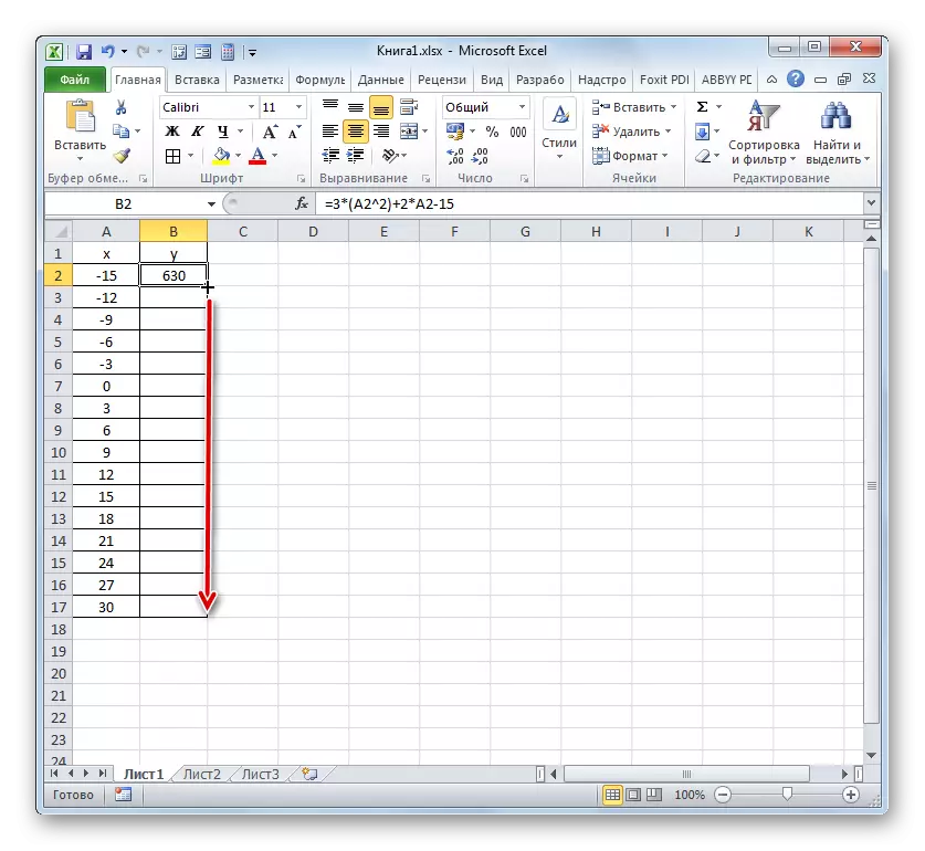
- The result of the function for the first argument of the formula is designed. But we need to calculate its values for other table arguments. Enter the formula for each value y a very long and tedious occupation. It is much faster and easier to copy it. This task can be solved using a filling marker and thanks to this property of references to Excel, as their relativity. When copying the formula to other R ranges y, the x values in the formula will automatically change relative to its primary coordinates.
We carry the cursor to the lower right edge of the element in which the formula was previously recorded. At the same time, a transformation should happen to the cursor. It will become a black cross that carries the name of the filling marker. Click the left mouse button and taking this marker to the lower borders of the table in the "Y" column.
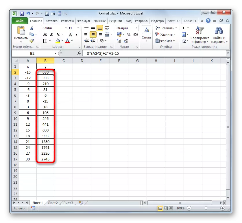
- The above action led to the fact that the "Y" column was completely filled with the results of the calculation of the formula y = 3x ^ 2 + 2x-15.
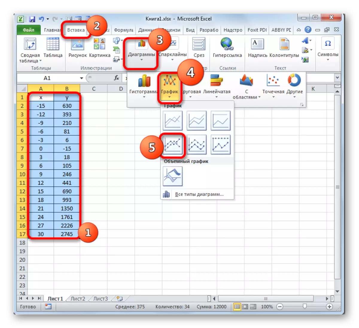
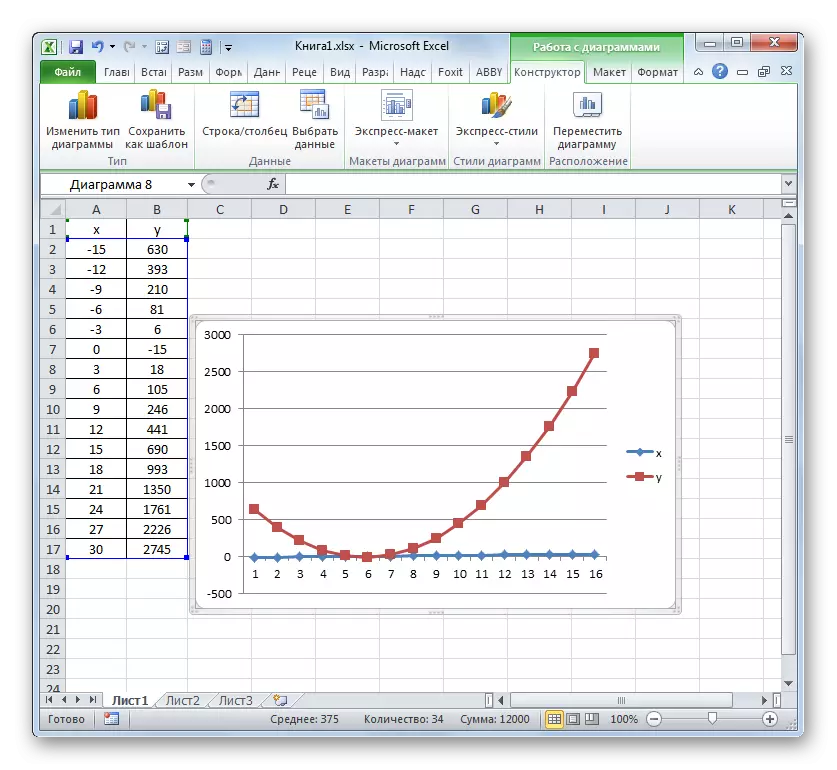
- Now it is time to build directly the diagram itself. Select all tabular data. Again in the "Insert" tab, press the "Chart" group "Chart". In this case, let's choose from the list of options "Schedule with markers".
- Chart with markers will be displayed on the construction area. But, as in the preceding cases, we will need to make some changes in order for it to acquire a correct look.
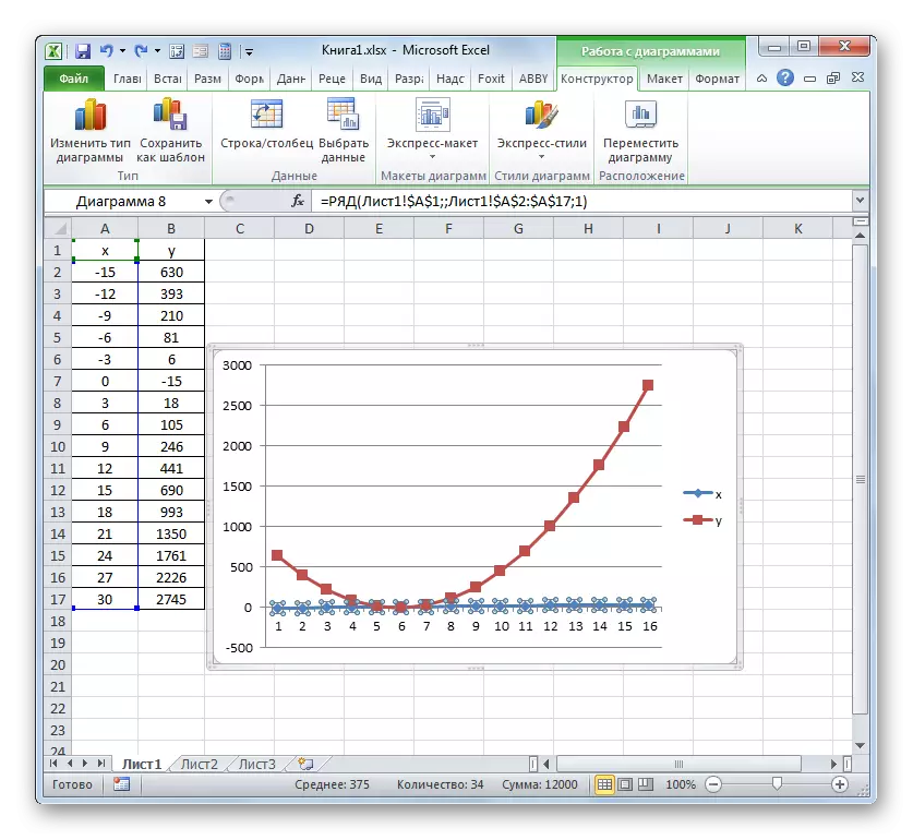
- First of all, we delete the line "X", which is located horizontally at the mark of 0 coordinates. We allocate this object and click on the Delete button.
- We also do not need a legend, since we have only one line ("Y"). Therefore, we highlight the legend and press the DELETE key again.
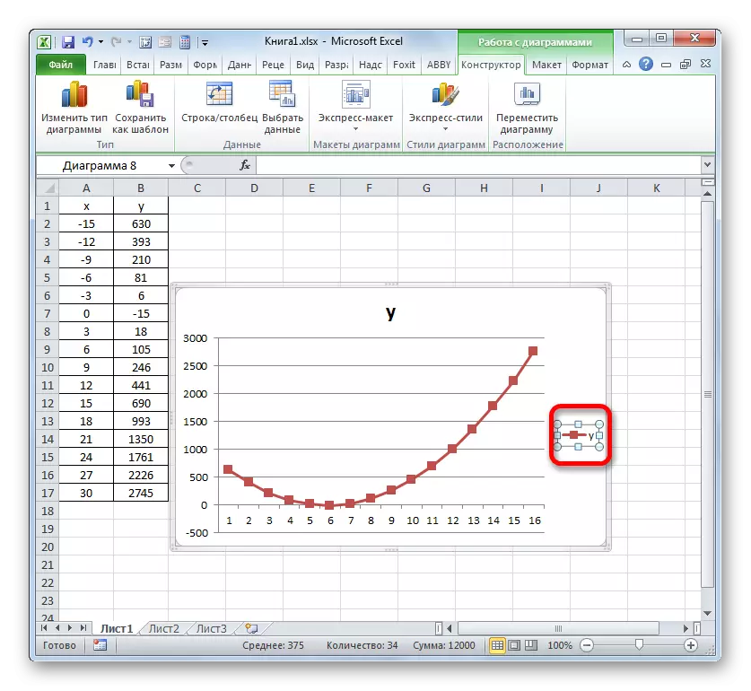
- Now we need to be replaced in the horizontal coordinate panel to those that correspond to the "X" column in the table.
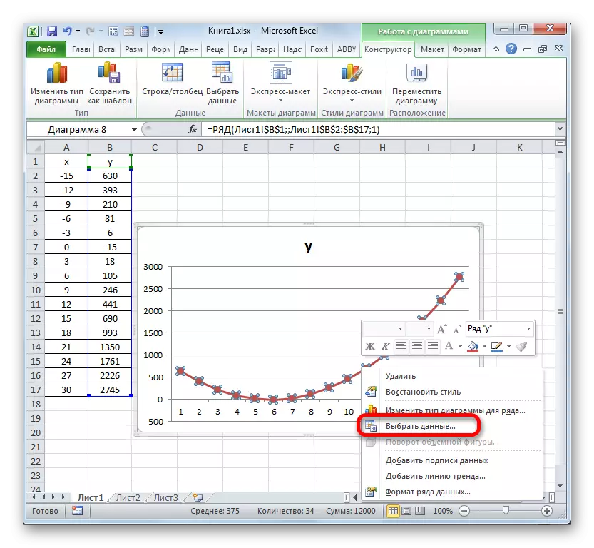
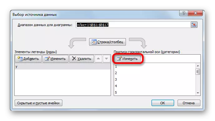
The right mouse button highlights the diagram line. Move the "Select data ..." in the menu.
- In the activated window of the source selection box, the "Change" button is already familiar to us, located in the "Signature of the horizontal axis".
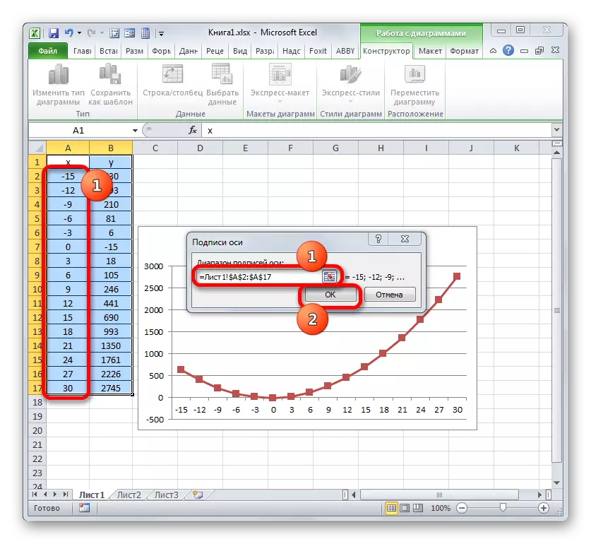
- The "axis signature" window is launched. In the area of the Range of Signatures of the Axis, we indicate the array coordinates with the data of the "X" column. We put the cursor to the field cavity, and then, producing the required clamp of the left mouse button, select all the values of the corresponding column of the table, excluding only its name. Once the coordinates are displayed in the field, clay on the name "OK".
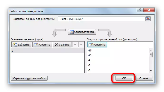
- Returning to the data source selection window, clay on the "OK" button in it, as before they did in the previous window.
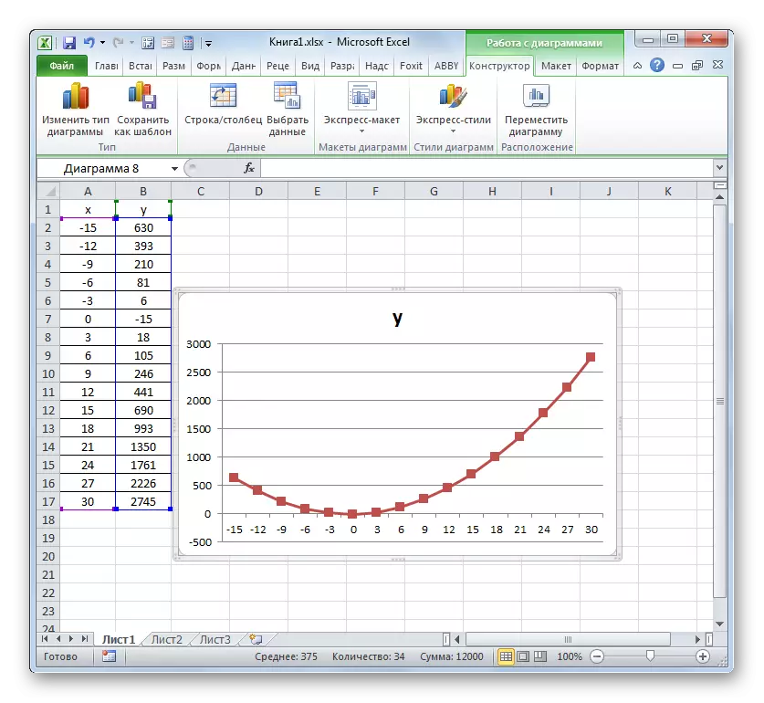
- After that, the program will edit the previously constructed chart according to the changes that were manufactured in the settings. A graph of dependence on the basis of an algebraic function can be considered finally ready.
Lesson: how to make autocomplete in Microsoft Excel
As you can see, using the Excel program, the procedure for constructing a circulation is greatly simplified in comparison with the creation of it on paper. The result of construction can be used both for training work and directly in practical purposes. A specific embodiment depends on what is based on the diagram: table values or a function. In the second case, before constructing the diagram, you will have to create a table with arguments and values of functions. In addition, the schedule can be built as based on a single function and several.