
The principle of creating a bar chart
The line diagram in Excel is used to display completely different informative data relating to the selected table. Because of this, the need arises not only to create it, but also to configure under their tasks. At first, it should be sorted out about the choice of a linear chart, and then proceed to the change of its parameters.
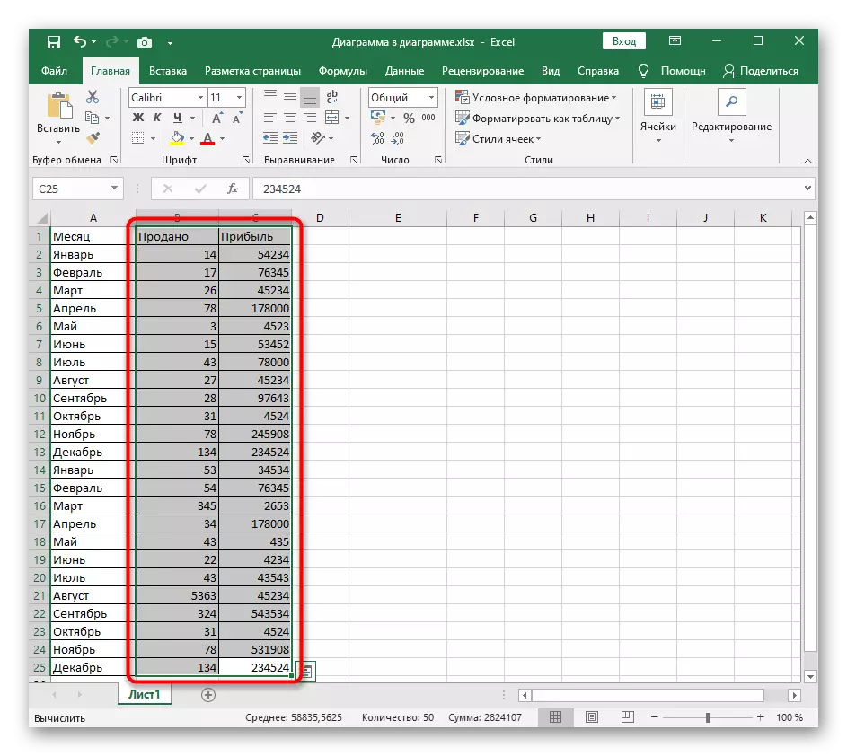
- Highlight the desired part of the table or its entirely, holding the left mouse button.
- Click the Insert tab.
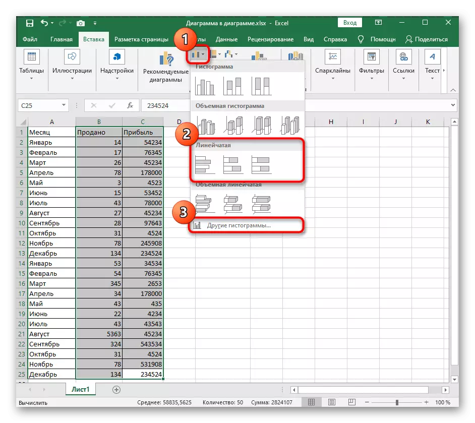
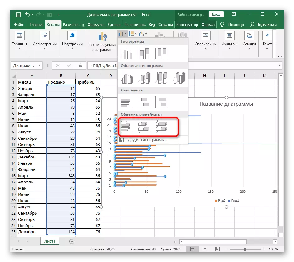
- In block with charts, expand the "Histogram" drop-down menu, where there are three standard linear graphs template and there is a button to go to the menu with other histograms.
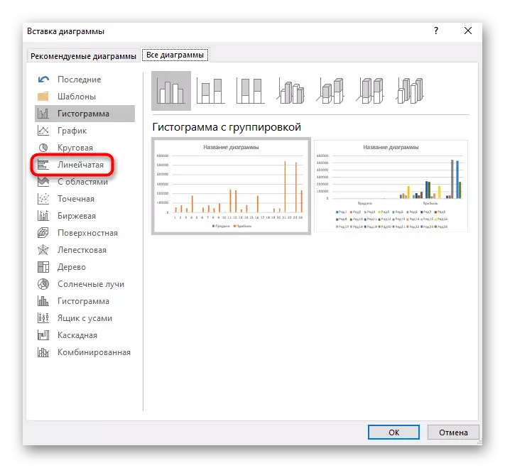
- If you press the latter, a new "Insert Chart" window will open, where, from the assorted list, select "Linely".
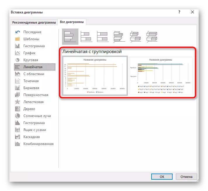
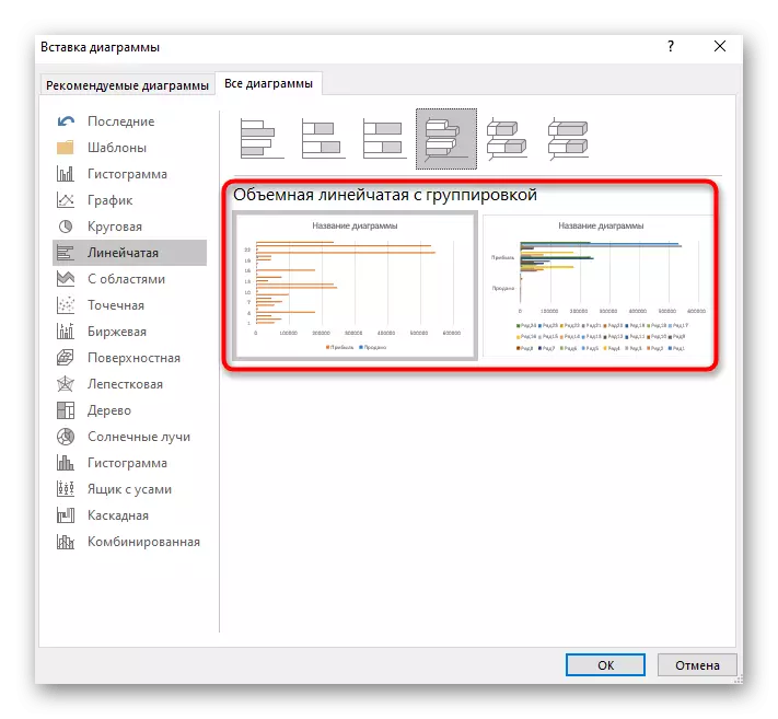
- Consider all the present charts to select the one that is suitable for displaying the working data. The version with the group is successful when you need to compare values in different categories.
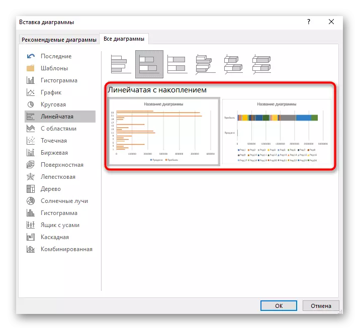
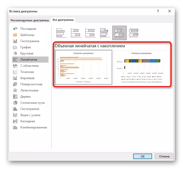
- The second type is a line with accumulation, allows you to visually display the proportions of each element to one whole.
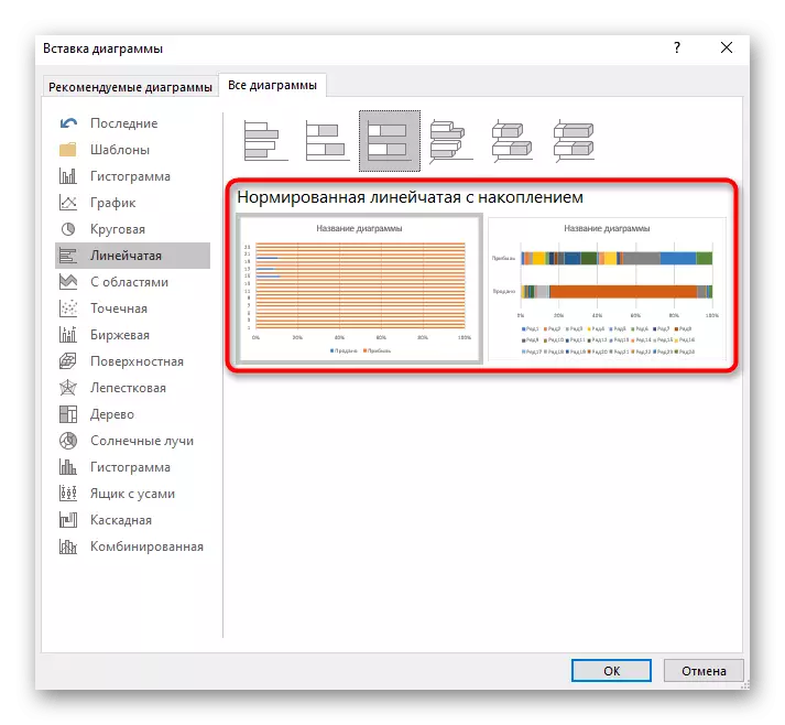
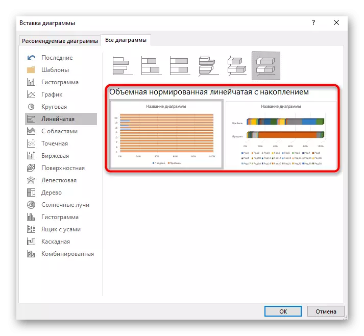
- The same type of chart, but only with the "normalized" prefix differs from the previous data to the data submission units. Here they are shown in the percentage ratio, and not proportionately.
- The following three types of bar diagrams are three-dimensional. The first creates exactly the same grouping that was discussed above.
- The accumulative surround diagram makes it possible to view a proportional ratio in one whole.
- The normalized volume is as well as two-dimensional, displays the data in percent.
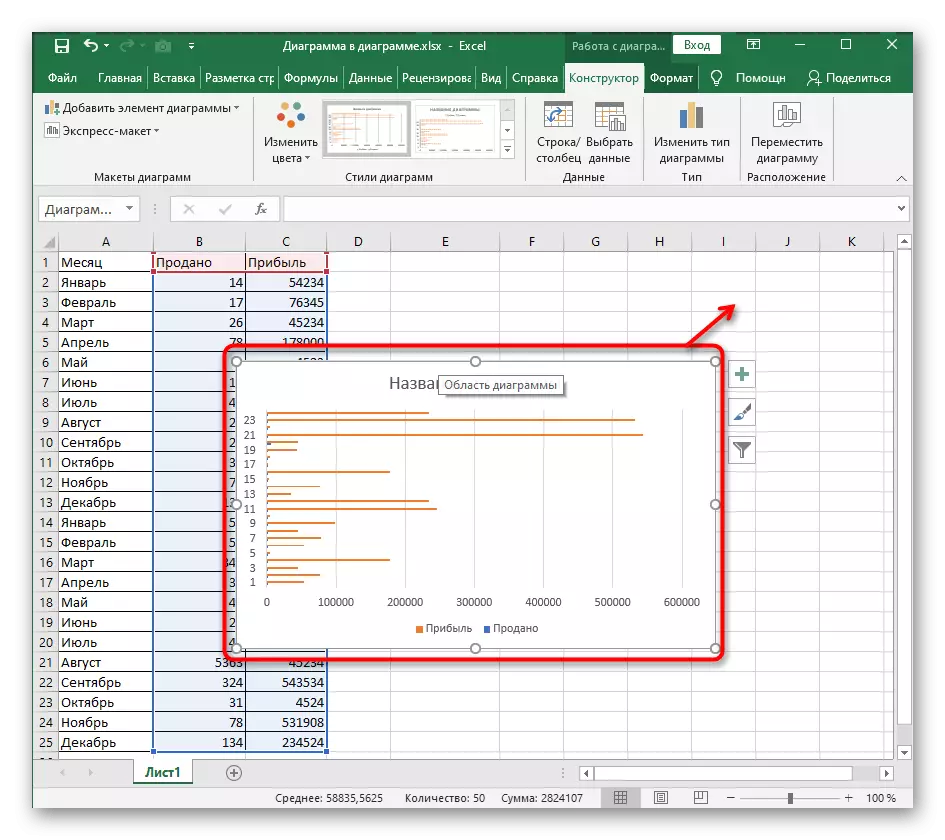
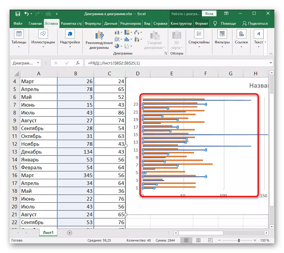
- Select one of the proposed bar charts, look at the view and click on ENTER to add to the table. Hold the graph with the left mouse button to move it to a convenient position.
Changing the figure of a three-dimensional line chart
Three-dimensional bar charts are also popular because they look beautiful and allow you to professionally demonstrate a comparison of data when project presentation. Standard Excel functions are able to change the type of shape of a series with data, leaving the classic option. Then you can adjust the format of the figure, giving it an individual design.
- You can change the figure of a line diagram when it was originally created in a three-dimensional format, so do it now if the schedule has not yet been added to the table.
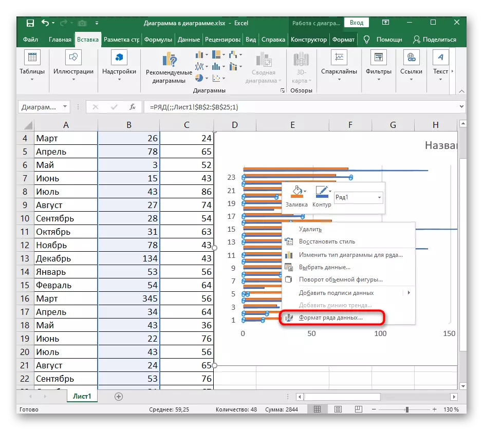
- Press LKM on the rows of the diagram data and spend up to highlight all values.
- Make the right button with the right mouse button and through the context menu, go to the section "Data range" section.
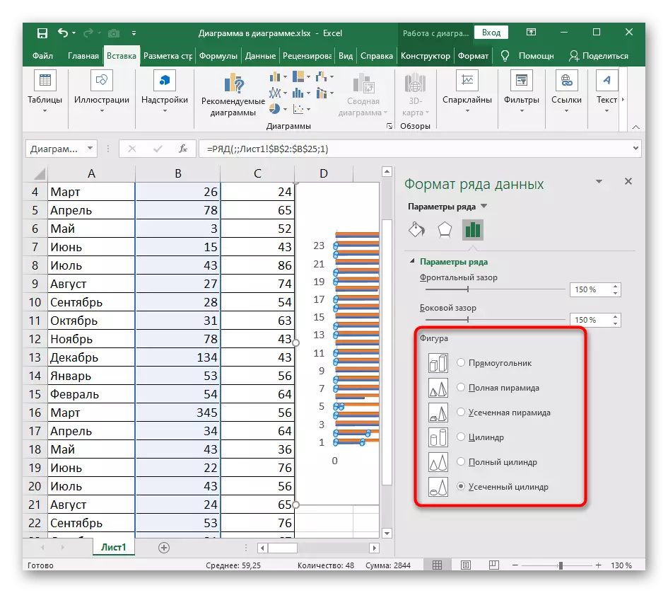
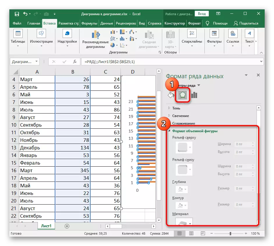
- On the right will open a small window that is responsible for setting up the parameters of the three-dimensional row. In the "Figure" block, mark the suitable figure for replacing the standard and look at the result in the table.
- Immediately then, open the section in the middle responsible for editing the format of the bulk figure. Ask her the relief, the contour and assign the texture when necessary. Do not forget to monitor changes in the chart and cancel them if you don't like something.
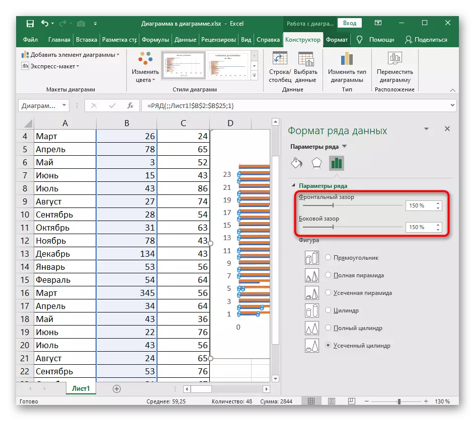
Change distance between diagram lines
In the same menu, working with a series diagram there is a separate setting that opens through the "Parameters of the Row" section. It is responsible for an increase or decrease in the gap between the rows of both the front side and side. Choose the optimal distance by moving these sliders. If suddenly the setup does not suit you, return the default values (150%).
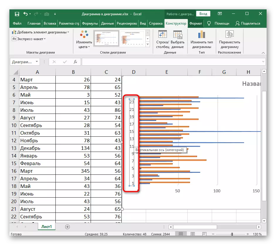
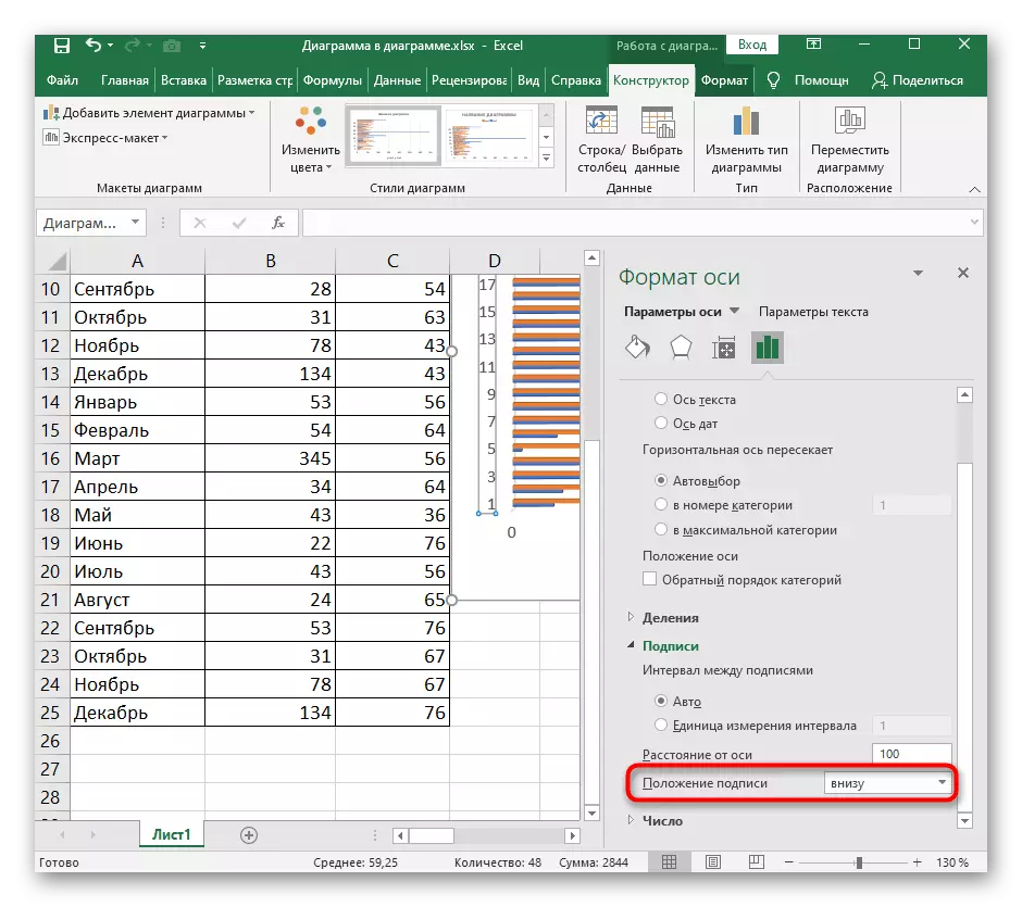
Changing the location of the axes
The last setting that will be useful when working with a timing diagram - change the location of the axes. It turns the axis of 90 degrees, making the display of the graph vertical. Usually, when you need to organize a similar type, users choose another type of diagrams, but sometimes you can simply change the setting of the current one.
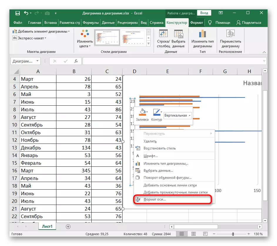
- Click on the axis right mouse button.
- A context menu appears through which you open the axis format window.
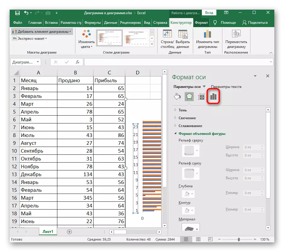
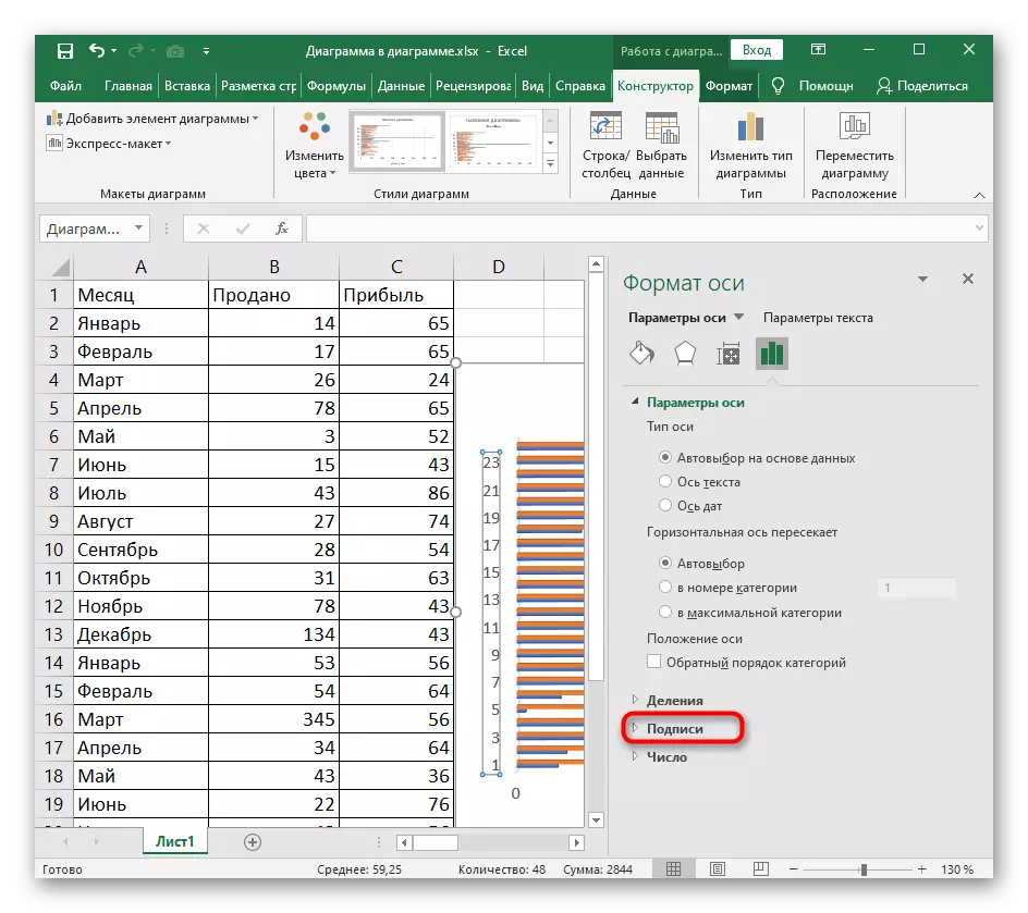
- In it, go to the last tab with the parameters.
- Expand the "Signatures" section.
- Through the "signature position" drop-down menu, select the desired location, for example, at the bottom or on top, and then check the result.