
Fonts ... Eternal care of photoshoppers - giving texts of attractiveness. This requires various circumstances, for example, the need to beautifully sign a photo or another composition. Variants of decoration Mass - from searching and applying ready-made styles (or creating their own) before using textures and layer overlay modes.
Today we will talk about how to stylize text using textures on it. All textures used in this lesson were found on the Internet and are in public affairs. If you plan to use the created image for commercial purposes, then it is better to buy such images on specialized sites - stocks.
Text texture
Before starting stylizing text, you need to decide on the composition (background image and texture). It should be understood that the general atmosphere of the image depends on the choice of components of the elements.
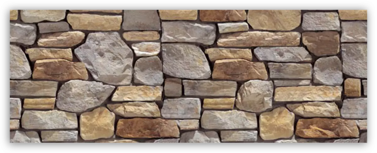
For the background it was chosen such a wall of stone:
Text we will make granite using the appropriate texture.

Location of textures on canvas
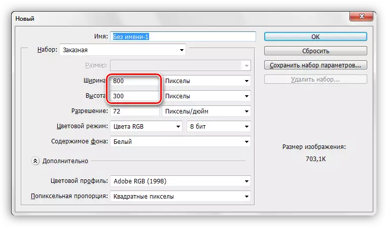
- Create a new document (Ctrl + N) of the size we need.
- Thinking the first texture on the photoshop window to our document.

- As you can see, a frame appeared on the texture with markers, pulling for which you can (you need) stretch it on the entire canvas. Try to scale the texture minimally in order to avoid loss of quality of the latter.

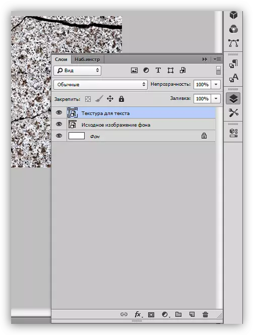
- The same is done with the second texture. The palette of the layers now looks like this:
Writing text
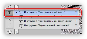
- Choose the "Horizontal text" tool.
- We write.

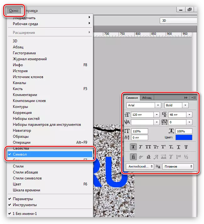
- The font size is selected depending on the size of the canvas, the color is not important. To change the characteristics, you must go to the "Window" menu and click on the "Symbol" item. A corresponding window will open in which you can change the font characteristics, but this is already the material for another lesson. While use the settings from the screenshot.
So, the inscription is created, you can proceed to the imposition of textures on it.
Font texture overlay
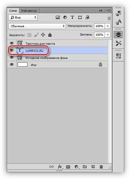
1. Move the layer with text under the layer with a granite texture. The text will disappear from the field of view, but it is temporary.
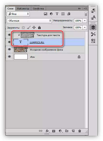
2. Press the ALT key and press the LKM to the word border (top texture and text). The cursor should change the form. With this action, we will "tie" texture to the text, and it will be displayed only on it.

Palette layers after all actions:
The result of overlaying the texture of granite on the text:

As you can see, the texture "stuck" to the inscription. It remains only to give the text of the volume and completeness of the entire composition.
Final processing
We will produce final processing by applying styles on the text layer.
1. To begin with, we will deal with the volume. Double-click on the layer with the text and, in the style settings window that opens, choose the item called "embossing". Pull the size slider is a bit to the right, and we will make the depth 200%.
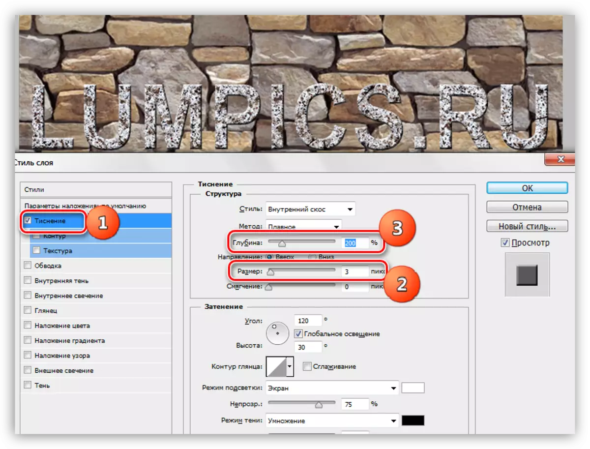
2. In order for our inscription "separated" from the wall, we turn to the "Shadow" point. Corner choose 90 degrees, offset and size - 15 pixels.

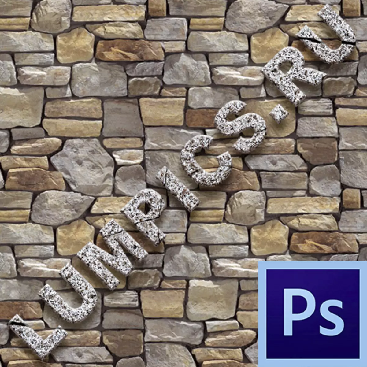
Take a look at the final result of the texture texture on the text:
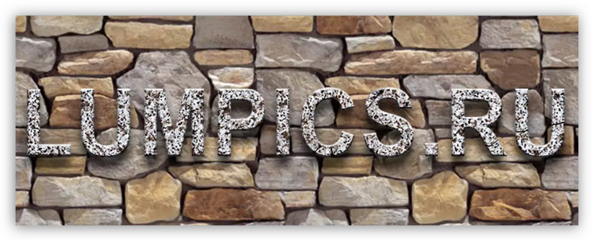
We got stylized granite inscription.
It was a universal way to overlay textures on any objects editable in Photoshop. Using it, you can texture fonts, figures, filled with in any color dedicated areas and even photos.
Finished a lesson to several tips.
- Pick the right background for your inscriptions, since it is precisely from the background that the overall impression of the composition depends.
- Try to use high-quality high-resolution textures, because when processing (scaling), unnecessary blurring may appear. Of course, you can give sharpness to texture, but this is an extra work.
- Do not act too strongly with styles on the text. Styles can give inscription excessive "plasticity" and, as a result, unnatural.
On this, everyone, lighten the techniques described in this lesson to get high-quality stylized texts.