

Photoshop, despite the fact that it is a raster editor, provides quite wide opportunities for creating and editing texts. Not Word, of course, but to develop design sites, business cards, advertising posters are enough.
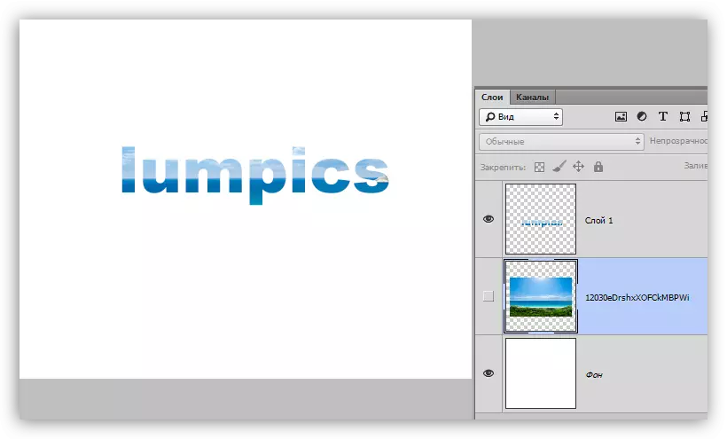
In addition to direct editing textual content, the program allows you to decorate fonts with styles. You can add shadows, glow, embossing, gradient fill and other effects to the font.
Lesson: Create a burning inscription in Photoshop
In this lesson, learn how to create and edit text content in Photoshop.
Editing text
In Photoshop, there is a group of tools designed to create texts. Like all tools, it is located on the left pane. The group contains four tools: "Horizontal text", "vertical text", "horizontal text-mask" and "vertical text-mask".

Let's talk about these tools in more detail.
Horizontal text and vertical text
These tools allow you to create horizontal and vertical orientation inscriptions, respectively. In the palette of the layers, a text layer is automatically created containing the appropriate content. The principle of operation of the tool will be described in the practical part of the lesson.

Horizontal text-mask and vertical text mask
When using tools data, a temporary fast mask is created. The text is printed in the usual way, the color is not important. The text layer is not created in this case.

After activating the layer (click on the layer), or the choice of another tool, the program creates a dedicated area in the form of written text.
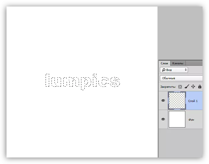
This selection can be used for different purposes: just paint it in some color, or when it is helped cutting text out of the image.
Text blocks
In addition to linear (in one line) of texts, Photoshop allows you to create text blocks. The main difference is the content contained in such a block, can not go beyond its borders. In addition, the "extra" text is hidden from visibility. Text blocks are subject to scaling and distortion. Read more - in practice.

We talked about the main tools for creating the text, we turn to the settings.
Settings text
Text setting is performed in two ways: directly during editing, when you can give various properties to individual characters,

Or apply editing and configure the properties of the text layer entirely.
Edit applies to the following ways: by pressing the button with a daw on the top panel of the parameters,

Click on the editable text layer in the palette of the layers,

Or activating any tool. In this case, edit the text can be used only in the "Symbol" palette.
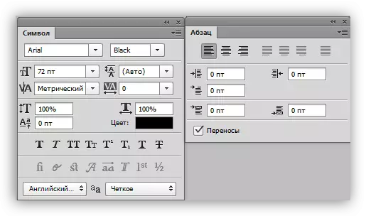
Text settings are located in two places: on the top panel of the parameters (with the activated tool "Text") and in the "Paragraph" and "symbol" palettes.
Parameter panel:

"Paragraph" and "symbol":
The palette data is called through the Window menu.

We turn directly to the basic text settings.
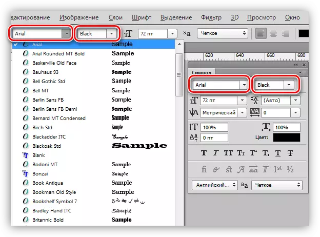
- Font.
The font is selected in the drop-down list located on the parameter panel, or in the characters setting panel. Nearby there is a list containing the sets of glyphs of different "weight" (fat, italic, bold items, etc.)
- The size.
Size can also be selected in the corresponding drop-down list. In addition, the numbers in this field are editing. By default, the maximum value is 1296 pixels.

- Colour.
Color is configured by clicking on the color field and the choice of shade in the palette. By default, the text is assigned a color that is at the moment the main one.

- Smoothing.
Smoothing determines how extreme (boundary) font pixels will be displayed. It is selected individually, the parameter "Do not show" removes all smoothing.

- Alignment.
Normal setting, which is available in almost every text editor. The text can be aligned on the left and right edge, in the center and all width. Width alignment is available only for text blocks.

Additional font settings in palette symbol
In the "Symbol" palette, there are settings inaccessible in the parameter panel.
- Glife styles.
Here you can make a font bold, inclined, make all the characters with line or capital, create an index from text (for example, write "Two in the square"), emphasize or cross the text.
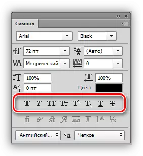
- Scale vertically and horizontal.
These settings determine the height and width of the characters, respectively.

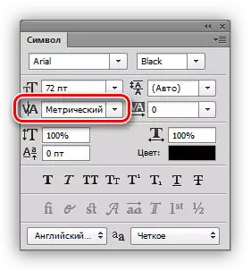
- INTERLINAGE (distance between lines).
The name speaks for itself. The setting determines the vertical indentation between the text strings.

- Tracking (distance between characters).
Similar setting, defining indents between text symbols.

- Kerning.
Determines selective indents between characters to improve appearance and readability. Kerning is designed to level the visual density of the text.
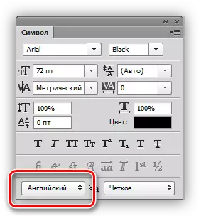
- Language.
Here you can select the language of the editable text to automate the simplicity of transfer and spell check.
Practice
1. Row.
To write text to one line, you need to take the text tool (horizontal or vertical), click on the canvas and print what is needed. Enter key transitions to a new string.

2. Text block.
To create a text block, you also need to activate the "Text" tool, click on the canvas and, without releasing the mouse button, stretch the unit.

The scaling of the block is carried out using markers located at the bottom of the frame.

The block distortion is made with the ctrl pinch. It is difficult to advise something here, try to raise with different markers.

For both options, the text application is supported by copy-paste (copy-insert).
On this lesson to edit text in Photoshop over. If you need, because of the circumstances, it often work with the texts, then you will thoroughly study this lesson, and practice.